Why Are There so Many Sub-Neptune Exoplanets?
Editor’s note: Astrobites is a graduate-student-run organization that digests astrophysical literature for undergraduate students. As part of the partnership between the AAS and astrobites, we occasionally repost astrobites content here at AAS Nova. We hope you enjoy this post from astrobites; the original can be viewed at astrobites.org.
Title: Superabundance of Exoplanet Sub-Neptunes Explained by Fugacity Crisis
Authors: Edwin S. Kite, et al.
First Author’s Institution: University of Chicago
Status: Published in ApJL
In the few decades since the discovery of the first exoplanet in 1992, we’ve realized that our own solar system is just plain weird. We have no hot-Jupiter gas-giant planets whizzing around our star in a matter of days, nor do we have any sub-Neptune planets, the most common type of planet in the galaxy. Critically, our lack of sub-Neptunes severely hinders our understanding of the transition between Earth-like and Neptune-like planets.
The Kepler Space Telescope operated 2009—2018 and discovered over 2,600 exoplanets, nearly 1,000 of which were classified as sub-Neptunes. But Neptune-like planets are considerably rarer, despite being only slightly bigger. This “radius cliff” (Fig. 1) separates sub-Neptunes (radii < 3 R⨁, where R⨁ is Earth’s radius) from Neptunes (radii > 3 R⨁). What could cause such a steep dropoff? Today’s authors explore this question.
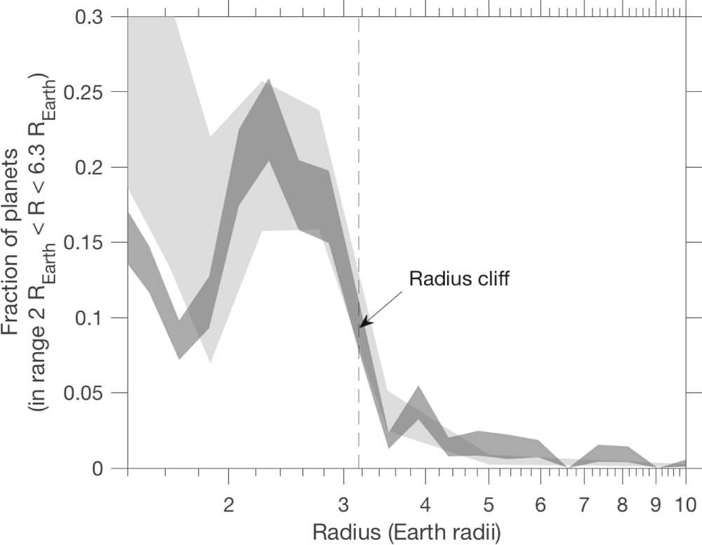
Figure 1. The exoplanet radius distribution. The two gray bands represent two different studies. The radius cliff is denoted near 3 R⨁ with the dashed line. [Kite et al. 2019]
Previous Model Shortcomings
Gas-giant planets are made primarily of … well … gas. Specifically, most of this gas is molecular hydrogen, H2. Smaller gas giants like Neptune and Uranus have a larger fraction of helium and methane than planets like Jupiter or Saturn, but their atmospheres are still primarily hydrogen (Fig. 2). Previous attempts to explain the sub-Neptune radius cliff have therefore focused on atmospheric hydrogen loss and accretion.
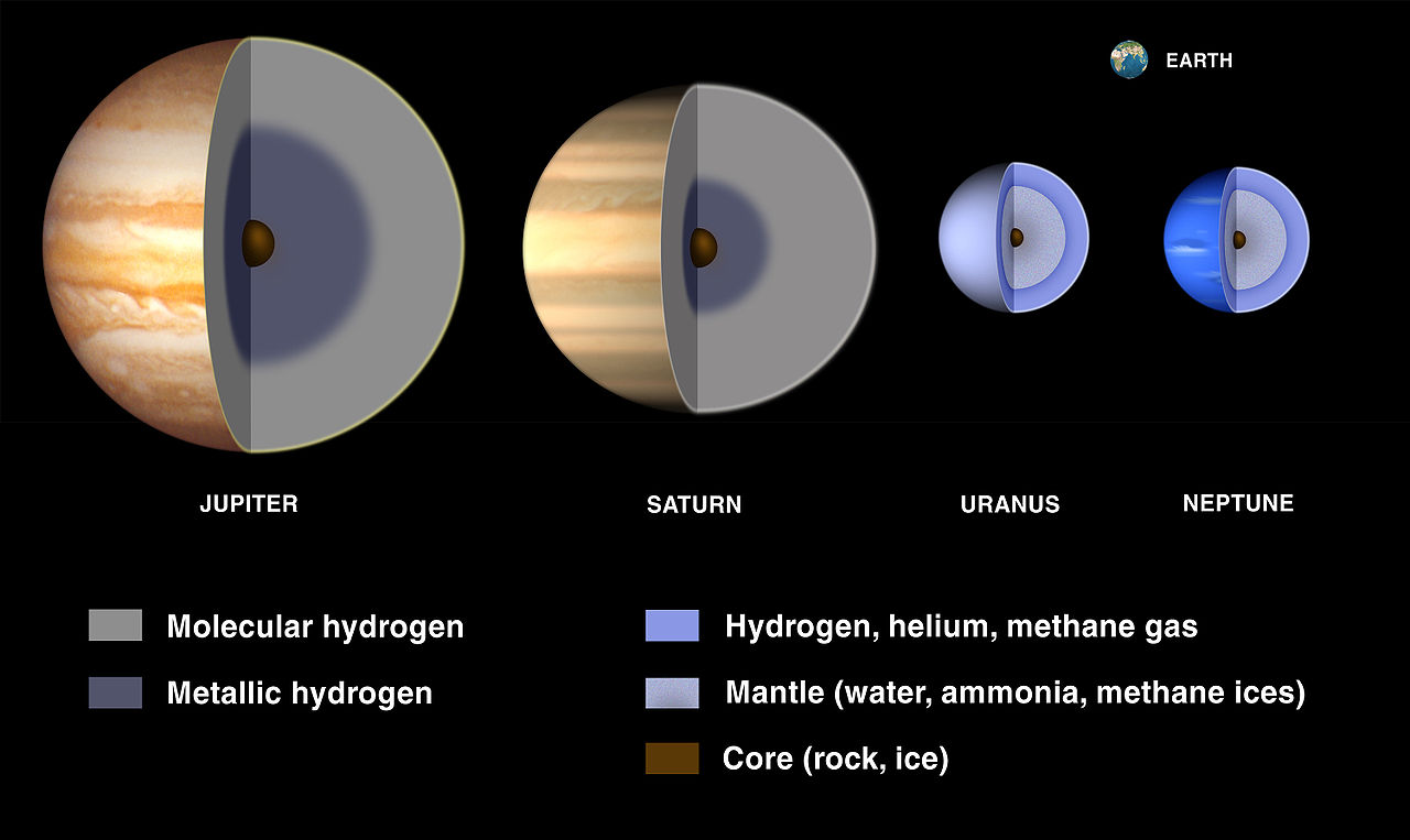
Figure 2: Atmospheric composition of gas-giant planets in our solar system. Jupiter and Saturn primarily boast hydrogen atmospheres, which turns into metallic hydrogen under the high pressures deep in the atmosphere. Neptune and Uranus are both smaller and colder, leading to a mantle of ices, and their atmospheres contain more helium and methane than the larger two planets. [NASA/Lunar and Planetary Institute]
An Active Core
One critical assumption that both of the previous explanations incorporated is that they left the planetary core chemically and thermally inert. That is, it does not interact at all with the atmosphere. Our own experiences on Earth, from the wavy lines radiating from the road on a hot day to the very existence of the water and carbon cycles, suggest that an inert core may not be a valid assumption (even though Earth is structured differently than a gas giant).
Today’s authors throw out the assumption that the core does not interact with the atmosphere. Additionally, the deep atmospheres of gas giants insulate and slow down the cooling of their cores, which results in a magma ocean that directly touches the atmosphere. The authors then look at how the solubility of H2 in magma depends on various atmospheric properties such as pressure and temperature.
The immense pressures at the magma–atmosphere interface mean that the properties of the gasses no longer follow the Ideal Gas Law. Instead, they behave non-linearly. In such high-pressure situations, the H2 molecules are so squished together that they begin to repel each other and can no longer be compressed. In this case, the only place the H2 can go is down, into the magma. Furthermore, the H2 no longer dissolves linearly (as in Henry’s Law) due to the high pressures. Therefore, as more and more gas accretes onto the atmosphere, more and more H2 dissolves into the magma, and the planet’s overall radius growth stalls. The authors call this non-linear solubility property of highly-pressurized H2 the “fugacity crisis,” where fugacity refers to a gas’s tendency to dissolve into an adjacent liquid.
The authors find that sub-Neptunes with radii of 2–3 R⨁ are so numerous because the atmospheres of planets that size reach the pressures required to force the H2 into the magma ocean. Then, once the magma ocean saturates, planetary radius growth can resume. However, planets that have enough gas to reach beyond the saturation point are much rarer, simply because they require much more gas. Hence, the radius cliff!
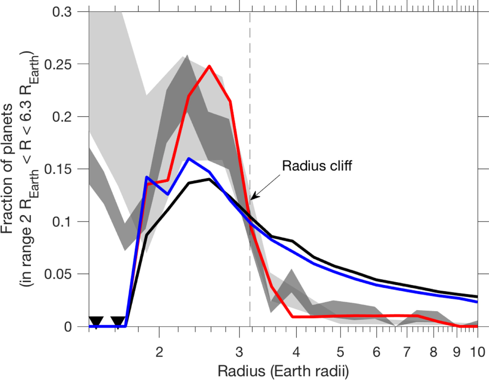
Figure 3: Same as Figure 1, but with the authors’ simulations added. The black line represents the case of an inert, impermeable core. The blue line shows the case where H2 dissolves linearly with pressure into the magma, as in Henry’s Law. The red line, and the focus of the authors’ work, incorporates non-linear effects and reproduces the radius cliff. [Kite et al. 2019]
Toward a More Complete Description of Sub-Neptunes
Today’s paper shows the importance of revisiting assumptions and considering additional factors to explain interesting phenomena. Even though the authors reproduced the radius cliff separating sub-Neptunes from Neptunes, they note that further research remains. Essentially no laboratory data exists about the true solubility of H2 in magma at the temperatures and pressures that exist in the depths of sub-Neptunes because no Earth-bound container can hold that magma. The authors instead extrapolated from lower temperature and pressure measurements. Additionally, the magma–atmosphere interface likely isn’t a hard boundary but rather more fuzzy, which would likely change how the H2 dissolves into the magma. Finally, the authors note that different core compositions would also likely change the interactions of the magma with the atmosphere.
On the plus side, the authors’ non-linear H2 dissolving model makes a number of predictions, including how steep the radius cliff is, non-dependence on planetary disk conditions, and the ratios of molecules present in sub-Neptune atmospheres. Future data from TESS will allow astronomers to test this latest hypothesis and bring us a step closer to understanding how planets form.
About the author, Stephanie Hamilton:
Stephanie is a physics PhD graduate and former NSF graduate fellow at the University of Michigan. For her research, she studies the orbits of the small bodies beyond Neptune in order learn more about the Solar System’s formation and evolution. As an additional perk, she gets to discover many more of these small bodies using a fancy new camera developed by the Dark Energy Survey Collaboration. When she gets a spare minute in the midst of hectic grad school life, she likes to read sci-fi books, binge TV shows, write about her travels or new science results, or force her cat to cuddle with her.


