From Globs to Gravitational Waves: A Simulated Cosmic Choreography
Editor’s Note: Astrobites is a graduate-student-run organization that digests astrophysical literature for undergraduate students. As part of the partnership between the AAS and astrobites, we occasionally repost astrobites content here at AAS Nova. We hope you enjoy this post from astrobites; the original can be viewed at astrobites.org.
Title: Formation and Evolution of Compact Binaries Containing Intermediate-Mass Black Holes in Dense Star Clusters
Authors: Seungjae Lee et al.
First Author’s Institution: Seoul National University
Status: Published in ApJ
A delicate dance goes on in astronomy between theory and observation. Most astronomy research, by and large, fits into one of two categories. In one category, you start with a theory, model, or simulation, and attempt to figure out what observations you might expect given those initial assumptions. The other approach begins with raw data and attempts to determine what kinds of theories, models, and fundamental astrophysical assumptions might give rise to it. Accepted knowledge usually happens when these two approaches agree and reinforce each other, but a lot of the actual science occurs when one side dances ahead of the other — either we have theories and models that make predictions that cannot yet be observationally tested, or we have data that defy attempts at fitting underlying models.
Another dynamical dance goes on in globular clusters between binary black holes. Today’s article investigates intermediate-mass black holes, or IMBHs, a pristine example of an astronomical topic in which theory has danced ahead of observations. IMBHs fill the gap between stellar mass and supermassive black holes. We can observe black holes in multiple ways, usually from the electromagnetic radiation of the gas disks surrounding some black holes (either stellar or supermassive), or the gravitational waves of two orbiting or merging black holes. Unfortunately, each method requires some extra component — either gas to accrete or a companion to orbit — and IMBHs are far more challenging to observe through these methods. Hence, we have a lot of ideas about how they might form, and scarce observational evidence for their existence.
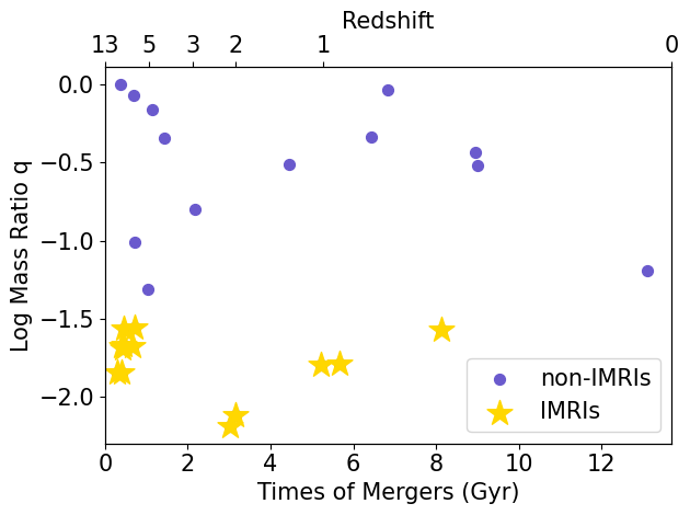
That hasn’t stopped many researchers from trying to make better models and predictions. One of the most commonly proposed mechanisms for forming IMBHs is in dense globular or nuclear star clusters (up to a million times denser than our region of the Milky Way). In these dense environments, stars and the black holes they produce might have a chance to find and run into each other often enough to reach the masses of the IMBH regime through mergers. Today’s authors use a series of N-body simulations to study these dense stellar clusters, into which they embed IMBHs. Their study investigates the detectability of gravitational waves from intermediate-mass-ratio inspirals (IMRIs). Because so many mergers occur in dense clusters, it allows for more mergers between objects with greater mass differences. The mass ratio between the two objects (usually denoted as ‘q’) is one of the most important parameters for characterizing a merger, and a high q value creates a gravitational wave signature that is different from a low q, even if the total mass of the system is the same.
To investigate the formation and detectability of IMRIs, the authors conducted a suite of direct N-body simulations of star clusters with total masses between 5×10⁴ and 105 solar masses, containing ~105 particles. They include initial conditions for how densely packed the particles should be, given how far they are from the cluster’s center (called a Plummer profile). They also include a rule for how the initial masses of the stars are distributed (called a Kroupa initial mass function). Then, they use a code called Stellar EVolution for N-body (SEVN) to follow the evolution of the stars in the system for 100 million years.
In that time, massive stars in the simulation can evolve into neutron stars and stellar-mass black holes. In addition to simulating the clusters’ stars, the authors embed an IMBH of 300–5,000 solar masses into the clusters. The key to this article is that some of the stellar-mass binary black holes will interact with the IMBH, creating an IMRI, which gives off gravitational waves. This article’s primary goal is to characterize these IMRIs and to test how well current and future gravitational wave detectors will measure them.
In the simulation, when a stellar-mass binary black hole and an IMBH come close, the authors must create a “merger criterion” — essentially, how it is decided whether the two objects merge, and what the subsequent “gravitational wave” would look like. Once they model the wave itself, they turn to five current or future detectors to see how well they will measure those waves if they were at particular astronomical distances from Earth.
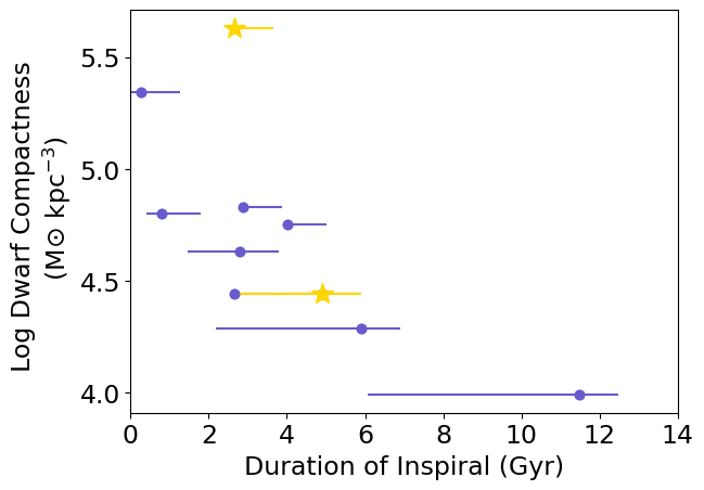
One of the primary relationships the authors look at in the cluster is the half-mass radius velocity dispersion of the cluster and the number of IMRI encounters between the IMBH and stellar-mass objects. One can think of the velocity dispersion as a more complicated “average velocity” of the stars in the cluster (a high velocity dispersion means, on average, the stars are moving faster, the half-mass radius is the distance from center that separates the inner half of the stars and outer half of the stars, and we use it because it is more representative of stellar motion in the overall cluster than the packed center or the mellow edge). Figure 1 shows the relationship between the number of IMRI events (y-axis) vs. the velocity dispersion (x-axis) of the cluster where the IMBH sits. Note that the y-axis is logarithmic, so a small increase in velocity dispersion actually results in a large increase in the number of IMRIs. This tells us that the number of events is much more dependent on the properties of the larger cluster than the IMBH itself.
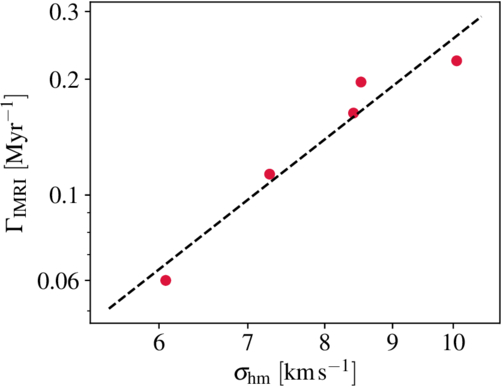
Figure 1: IMRI event rate as a function of cluster half-mass velocity dispersion (σhm) for 1,000-solar-mass IMBHs in the simulations. The IMRI merger rate is highly sensitive to the velocity dispersion of the cluster as a whole, making it a key observable of how efficiently IMRIs can form and merge in a given cluster. [Lee et al. 2025]
How do the authors translate the gravitational wave signal from the IMRI into what might be observed on Earth? First, they must pick a signal-to-noise ratio threshold, which is the ratio of the gravitational wave signal to the background noise in the detector. In this case, they chose a signal-to-noise ratio of 8, a commonly chosen threshold in the gravitational wave literature. From the signal-to-noise ratio, the authors can calculate a horizon distance. The horizon distance is the distance that a detector can measure a specific gravitational wave event with a given set of properties at or above the threshold chosen. Figure 2 shows the horizon distances (y-axis) for each detector for sets of gravitational wave sources with different properties vs. the mass of the IMBH generating the gravitational wave (x-axis). The solid and dotted lines represent two chosen masses of the IMBH’s stellar-mass companion. The figure shows that aLIGO (blue circles) can detect only low-mass IMBHs (≲ 300 solar masses) at a redshift of z ≲ 0.05. ET (red triangles) is sensitive to lower-mass IMBHs, and LISA (green diamonds) excels at detecting higher-mass IMBHs. aSORGO (purple triangles) covers a broad mass range but at lower redshifts. DECIGO (yellow Xs) offers the broadest mass range at the highest redshift.
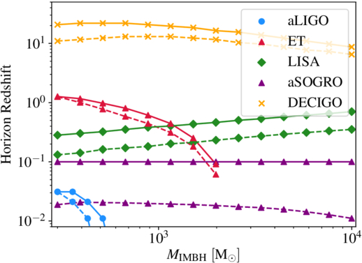
Figure 2: Horizon redshift vs. IMBH mass for several gravitational wave observatories (aLIGo represented by blue circles, ET by red triangles, LISA by green diamonds, aSOGRO by purple triangles, and DECIGO by yellow x‘s). Solid vs. dotted lines represent the mass of the stellar-mass black hole interacting with the IMBH, with the dashed line representing a 10-solar-mass companion and the solid lines representing a 60-solar-mass companion. [Lee et al. 2025]
Original astrobite edited by Kasper Zoellner.
About the author, William Smith:
Bill is a graduate student in the astrophysics program at Vanderbilt University. He studies gravitational wave populations with a focus on how these populations can help inform cosmology as part of the LIGO Scientific Collaboration. Outside of astrophysics, he also enjoys swimming semi-competitively, music and dancing, cooking, and making the academy a better place for people to live and work.