
X Marks the Region
Editor’s note: Astrobites is a graduate-student-run organization that digests astrophysical literature for undergraduate students. As part of the partnership between the AAS and astrobites, we occasionally repost astrobites content here at AAS Nova. We hope you enjoy this post from astrobites; the original can be viewed at astrobites.org.
Title: Hidden Worlds: Dynamical Architecture Predictions of Undetected Planets in Multi-planet Systems and Applications to TESS Systems
Authors: Jeremy Dietrich and Dániel Apai
First Author’s Institution: The University of Arizona, Tucson
Status: Published in AJ
Fans and writers of science fiction alike spend countless hours crafting intricate star systems, replete with planets, moons, and a menagerie of space-faring civilisations. The success of missions such as the Kepler Space Telescope (hereafter Kepler) and the Transiting Exoplanet Survey Satellite (TESS) have shown that our solar system is just one of many multi-planet systems present throughout the Milky Way. However, our ability to accurately determine the “planetary architecture” (the orbital configuration of the planets) of a given extrasolar system is severely lacking. Knowing how planets are configured in different extrasolar systems would greatly aid our understanding of how planets form, and how planetary systems evolve (e.g., via planetary migration).
Exoplanets are inherently difficult to detect, and one of the primary means of detecting them involves measuring transits, the tiny dimming of a star as a planet moves in front of it. To better understand stellar systems, instead of considering each exoplanet individually, we can consider the entire population of exoplanets at once through statistical inference — a method that has only recently become viable thanks to the wealth of data from modern exoplanet surveys. Today’s paper presents a statistical framework — DYNAmical Multi-planet Injection TEster (DYNAMITE) — designed to predict the presence of exoplanets that have so far eluded detection.
Fire in the Hole!
The core method at the heart of DYNAMITE is to determine the likelihood of finding an additional planet in an existing multi-planet system, based on the overall statistics of an existing representative population. The authors consider a combined probability density function (PDF) over the inclination, orbital period, and planetary radius, with the key assumption being that each of these parameters has its own independent distribution. Each of these initial PDFs were based on transiting planet data from Kepler, with the range of orbital periods restricted from 0.5 to 730 days, planetary radii from 0.5 to 5 Earth radii, and inclinations between 0 and 180 degrees. Monte Carlo methods (means of approximating something through repeated random sampling) are then used to sample the full probability distributions and “inject” new planets into the system. In order to come up with sensible results, the planetary system must be dynamically stable. This stability depends on the orbits of the innermost and outermost planets, their masses, and the mass of the parent star. It is difficult to accurately determine the masses of exoplanets via the common transit method, so the authors make use of a mass–radius relation to estimate the masses from the planetary radii.
Sweet Spot
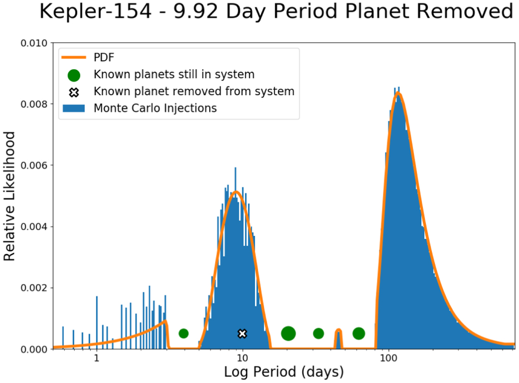
Figure 1: The probability distribution function for the Kepler-154 system with the 9.92-day-period planet removed (outlined cross). Blue spikes indicate individual Monte Carlo injections. Green circles indicate the relative sizes of the known planets. Click to enlarge. [Dietrich & Apai 2020]
Speculative Execution
One of DYNAMITE’s major applications lies in the analysis of systems with candidate planets — planets that are suspected to be there but have not yet been definitively confirmed. TOI 1469 is used as an example to illustrate the iterative nature of the statistical model. Figure 2 shows the various stages of DYNAMITE for the TOI 1469 (HD 219134 / Gliese 892) system. This system is known to have two transiting planets, with at least three non-transiting planets. Starting with only the two known transiting planets, the PDF peaks at around 12.5 days. A planet is inserted here, and the model is run again. Now the PDF peaks near the known planet at around 23 days (HD 219134 f has a period of 22.72 +/- 0.02 days), so we insert another planet here and execute the model again. Proceeding in this manner, the model predicts another planet at ~46 days (corresponding to HD 219134 f with orbital period 46.86 +/- 0.03 days), while in the last iteration the model predicts a fourth planet at ~87 days, corresponding to the unconfirmed candidate planet.

Figure 2: Probability distribution functions of the orbital period for each iteration of DYNAMITE for the TOI 1469 multi-planet system. [Dietrich & Apai 2020]
To Probability Space and Beyond
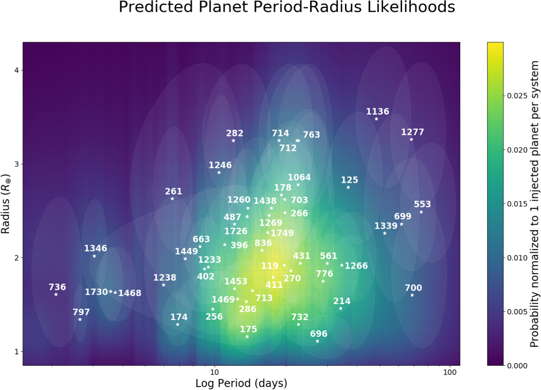
Figure 3: 2D normalised probability densities in log radius and log period. Brighter regions correspond to a higher probability of a predicted planet. Multi-planetary systems are marked along with their TESS TOI identifiers. Ellipses indicate one standard error. [Dietrich & Apai 2020]
Another purpose of DYNAMITE is to analyse the newly identified multi-stellar systems discovered by TESS and identify the systems most likely to contain additional planets so that they can be surveyed again. A sample of known multi-stellar systems from the ExoFOP-TESS archive was tested with the statistical model. Figure 3 shows the overall results of the model using the period ratio model from Kepler, while Figure 4 shows the exact PDF for each TESS system for the orbital period and planetary radius.
With the ability to predict the locations of hitherto undetected planets, future surveys can be more focused and targeted. Studying these systems in detail, and confirming whether or not these additional planets are present, allows us to constrain and refine models of planetary architectures, our knowledge of the mechanisms that govern the evolution of planetary systems, and, ultimately, our understanding of how exoplanets form.
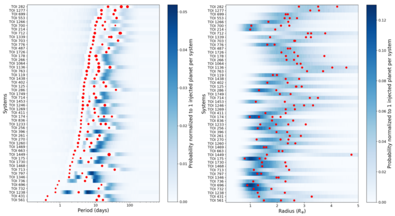
Figure 4: The normalised PDF for each TESS sample for orbital period (left) and planetary radius (right). Red dots indicate known planets, with the size of each dot representing that planet’s relative size. Darker regions highlight the most likely regions in which to find additional planets. [Adapted from Dietrich & Apai 2020]
About the author, Mitchell Cavanagh:
Mitchell is a PhD student in astrophysics at the University of Western Australia. His research is focused on the applications of machine learning to the study of galaxy formation and evolution. Outside of research, he is an avid bookworm and enjoys gaming, languages, and code jams.


")


