Astrobites RSS

hot Jupiter

Editor’s note: Astrobites is a graduate-student-run organization that digests astrophysical literature for undergraduate students. As part of the partnership between the AAS and astrobites, we repost astrobites content here at AAS Nova once a week. We hope you enjoy this post from astrobites; the original can be viewed at astrobites.org!

Title: Evidence for Two Hot Jupiter Formation Paths
Authors: Benjamin E. Nelson, Eric B. Ford, and Frederic A. Rasio
First Author’s Institution: Northwestern University
Status: Submitted to AJ, open access

Frolicking Through Fields of Data

The future of astronomy observations seems as bright as the night sky … and just as crowded! Over the next decade, several truly powerful telescopes are set to launch (read about a good number of them here and also here). That means we’re going to have a LOT of data on everything from black holes to galaxies, and beyond — and that’s in addition to the huge fields of data from the past decade that we’re already frolicking through now. It’s certainly far more data than any one astronomer (or even a group of astronomers) wants to analyze one-by-one; that’s why these days, astronomers turn more and more to the power of astrostatistics to characterize their data.

The authors of today’s astrobite had that goal in mind. They explored a widely-applicable, data-driven statistical method for distinguishing different populations in a sample of data. In a sentence, they took a large sample of hot Jupiters and used this technique to try and separate out different populations of hot Jupiters — based on how the planets were formed — within their sample. Let’s break down exactly what they did, and how they did it, in the next few sections!

Hot Jupiters Are Pretty Cool

First question: what’s a hot Jupiter, anyway?

They’re actually surprisingly well-named: essentially, they are gas-giant planets like Jupiter, but are much, much hotter. (Read all about them in previous astrobites, like this one and this other one!) Hot Jupiters orbit perilously close to their host stars — closer even than Mercury does in our own Solar System, for example. But it seems they don’t start out there. It’s more likely that these hot Jupiters formed out at several AU from their host stars, and then migrated inward into the much closer orbits from there.

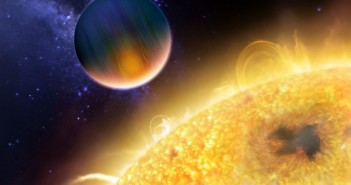
Figure 1: A gorgeous artist’s impression of a hot Jupiter orbiting around its host star. [ESO/L. Calçada]

As to why hot Jupiters migrate inward … well, it’s still unclear. Today’s authors focused on two migration pathways that could lead to two distinct populations of hot Jupiters in their sample. These migration theories, as well as what the minimum allowed distance to the host star (the famous Roche separation distance, aRoche) would be in each case, are as follows:

  • Disk migration: hot Jupiters interact with their surrounding protoplanetary disk, and these interactions push their orbits inward. In this context, aRoche corresponds to the minimum distance that a hot Jupiter could orbit before its host star either (1) stripped away all of the planet’s gas or (2) ripped the planet apart.
  • Eccentric migration: hot Jupiters start out on very eccentric (as in, more elliptical than circular) orbits, and eventually their orbits morph into circular orbits of distance 2aRoche. In this context, aRoche refers to the minimum distance that a hot Jupiter could orbit before the host star pulled away too much mass from the planet.

The authors defined a parameter ‘x’ for a given hot Jupiter to be x = a/aRoche, where ‘a’ is the planet’s observed semi-major axis. Based on the minimum distances in the above theories, we could predict that hot Jupiters that underwent disk migration would have a minimum x-value of x = aRoche/aRoche = 1. On the other hand, hot Jupiters that underwent eccentric migration would instead have a minimum x-value of x = 2aRoche/aRoche = 2. This x for a given planet is proportional to the planet’s orbital period ‘P’, its radius ‘R’, and its mass ‘M’ in the following way:

x = a/aRoche ~ P2/3M1/3R-1

And this x served as a key parameter in the authors’ statistical models!

Toying with Bayesian Statistics

Next question: how did today’s authors statistically model their data?

Figure 2: Probability distribution of x for each observation group, assuming that each hot Jupiter orbit was observed along the edge (like looking at the thin edge of a DVD). The bottom panel zooms in on the top one. Note how the samples have different minimum values! [Nelson et al. 2017]

Short answer: with Bayesian statistics. Basically, the authors modeled how the parameter x is distributed within their planet sample with truncated power laws — so, x raised to some power, cut off between minimum and maximum x values. They split their sample of planets into two groups, based on the telescope and technique used to observe the planets: “RV+Kepler” and “HAT+WASP”. Figure 2 displays the distribution of x for each of the subgroups.

The authors then used the Markov Chain Monte Carlo method (aka, MCMC; see the Bayesian statistics link above) to explore what sort of values of the power laws’ powers and cutoffs would well represent their data. Based on their chosen model form, they found that the RV+Kepler sample fit well with their model relating to eccentric migration. On the other hand, they found evidence that the HAT+WASP sample could be split into two populations: about 15% of those planets corresponded to disk migration, while the other 85% or so corresponded to eccentric migration.

Remember that a major goal of today’s authors was to see if they could use this statistical approach to distinguish between planet populations in their sample … and in that endeavor, they were successful! The authors were thus optimistic about using this statistical technique for a much larger sample of hot Jupiters in the future, as oodles of data stream in from telescopes and surveys like KELT, TESS, and WFIRST over the next couple of decades.

Their success joins the swelling toolbox of astrostatistics … and just in time! Telescopes of the present and very-near future are going to flood our computers with data — so unless we’re willing to examine every bright spot we observe in the sky by hand, we’ll need all the help from statistics that we can get!

About the author, Jamila Pegues:

Hi there! I’m a 1st-year grad student at Harvard. I focus on the evolution of protoplanetary disks and extrasolar systems. I like using chemical/structural modeling and theory to explain what we see in observations. I’m also interested in artificial intelligence; I like trying to model processes of decision-making and utility with equations and algorithms. Outside of research, I enjoy running, cooking, reading stuff, and playing board/video games with friends. Fun fact: I write trashy sci-fi novels! Stay tuned — maybe I’ll actually publish one someday!

first stars

Editor’s note: Astrobites is a graduate-student-run organization that digests astrophysical literature for undergraduate students. As part of the partnership between the AAS and astrobites, we repost astrobites content here at AAS Nova once a week. We hope you enjoy this post from astrobites; the original can be viewed at astrobites.org!

Title: Modeling of Lyman-Alpha Emitting Galaxies and Ionized Bubbles at the Era of Reionization
Authors: Hidenobu Yajima, Kazuyuki Sugimura, Kenji Hasegawa
First Author’s Institution: Tohoku University, Sendai, Miyagi, Japan
Status: Submitted to ApJ, open access

About four hundred thousand years after the Big Bang, the universe settled into a pretty dull period in its history. There were no stars or galaxies, just one massive expanse of neutral hydrogen, sitting in the dark. This period in the universe’s history, known appropriately as the Dark Ages, came abruptly to an end when the first stars were born and began to shine, dumping loads of high-energy photons into their surroundings. These photons created ‘bubbles’ of ionised hydrogen around the stars, which slowly grew as more photons were pumped out by the stars. The bubbles surrounding the first stars were pretty small, but later, as stars began to group together into the first galaxies, these bubbles were blown much bigger by the combined photons from all the stars in the galaxy. Over time the bubbles from neighbouring galaxies began to overlap, until eventually all of the hydrogen in the universe was ionised (see Figure 1). This process is known as reionisation (Astrobites has written plenty about reionisation in the past; for more background, go check out some of these articles), and it’s a key period in the universe’s history.

The subject of today’s bite are these ionised bubbles, the baby galaxies that blew them, and how much they contributed to reionisation. We will see that there is a close relationship between the properties of a galaxy and the size of the bubble it can blow. The size of the bubble also affects how easily we can see the galaxy. Finally, we’ll also learn about two upcoming observatories that will hopefully be able to see both the bubbles and their galaxies at earlier times than ever before.

reionisation timeline

Figure 1: A timeline showing the beginning of the Dark Ages (at recombination), and its end when the first stars and galaxies were born, ionising nearby hydrogen. These ionised bubbles soon grow and overlap, until the majority of the Hydrogen in the universe is ionised; this period is known as the Epoch of Reionisation [Nature 468].

Who blew all the bubbles?

One burning question researchers would like answered is ‘What kinds of galaxies contributed the most to reionisation?’ Many researchers in the field assert that it was small galaxies; they tend to allow their ionising photons to escape much easier than massive galaxies as they have less gas to get in the way. There are also far more small galaxies than big ones: more galaxies, more high-energy photons, more reionisation! Unfortunately, such small galaxies are typically harder to detect than their big cousins since they’re less luminous.

bubble size

Figure 2: Size of ionised hydrogen bubbles (RHII) plotted against the luminosity of the Lyman-alpha emission (LLyα). The bigger the bubble, the stronger the emission. This relationship doesn’t change much with redshift.

That’s not to say that finding small galaxies is impossible. In the early universe, galaxies tend to be creating lots of new stars, and these young stellar populations emit light with a strong hydrogen spectral line, known as Lyman-alpha. Using Lyman-alpha, astronomers hope to be able to see the small galaxies that contribute to reionisation in a big way.

Unfortunately, as it’s so energetic, Lyman-alpha radiation is absorbed by neutral hydrogen. So how can we detect it from before the universe was ionised? The trick is to choose galaxies that have blown large bubbles. Galaxies with large enough bubbles allow any newly emitted ionising radiation from the galaxy to travel far enough uninhibited through the bubble to become redshifted. Redshifted Lyman-alpha radiation doesn’t have enough energy to ionise the neutral hydrogen outside the bubble, so it can happily continue travelling all the way to our telescopes on Earth, 12 billion light-years away.

So now the question is, what galaxies blow the biggest bubbles? The authors of today’s paper use a simulated model of the early universe to investigate this. Figure 2 shows the predicted size of ionised bubbles against the luminosity of Lyman-alpha. There’s a strong correlation between bubble size and luminosity. So … what galaxies emit the most Lyman-alpha? The bottom left panel of Figure 3 shows the relationship between Lyman-alpha luminosity and stellar mass. There is a clear correlation between the size of a galaxy and the amount of Lyman-alpha radiation it’s pumping out.

ly-alpha strength against stellar mass

Figure 3: The relationships between bubble size and Lyman-alpha luminosity (y axis, top and bottom respectively) with stellar mass and star formation rate (x axis, left and right respectively). The different coloured lines are for different redshifts. The biggest galaxies emit the most Lyman-alpha, and therefore blow the biggest bubbles. The link between bubble size and star formation rate is not as strong.

What does this all tell us? For a start, the model seems to suggest that we won’t be able to see the very smallest galaxies at very high redshifts using Lyman-alpha. All is not lost, however: thanks to two upcoming observatories, we may still be able to see the most energetic Lyman-alpha emitting galaxies and their bubbles at redshifts of around z ~ 10, much higher than we’ve ever seen them before (The most distant Lyman-alpha emitter found to date is at z ~ 8.6).

The first of these new observatories will be the James Webb Space Telescope (JWST), an enormous space-based telescope scheduled to launch in 2018. It will be capable of detecting Lyman-alpha radiation out to very high redshifts: the horizontal line in Figure 2 shows the expected sensitivity of the instrument, within range of the most luminous Lyman-alpha emitters at z ~ 10 according to the model.  

The second of these enormous observatories to come online will be the Square Kilometer Array (SKA), a truly enormous radio telescope array based in both South Africa and Australia. It will be able to ‘see’ neutral hydrogen, leaving the ionised hydrogen bubbles to stand out like holes in a cheese. The vertical dashed line in Figure 2 shows the smallest bubble size that it’s hoped the SKA will be able to see, again well within the range of the biggest bubbles at ~ 10.

Combining these observatories, the yellow region in Figure 2 represents those galaxies with bubbles are that are big enough to be observed with the SKA, and that allow enough Lyman-alpha escape to be picked out by JWST. If the model is correct, these will be the most distant Lyman-alpha emitters observed, and the first-ever detection of ionised bubbles. But the smaller galaxies, thought to be responsible for the majority of reionisation, will have to wait for future generations of humongous space- and ground-based telescopes to be detected.

About the author, Christopher Lovell:

I’m a 2nd year postgrad at the University of Sussex. I model high redshift galaxies using hydrodynamical simulations. When I’m not reading for work I read for pleasure, mostly science fiction and history, and when I’m not reading I enjoy dodging London traffic on my bike.

computers

Editor’s note: Astrobites is a graduate-student-run organization that digests astrophysical literature for undergraduate students. As part of the partnership between the AAS and astrobites, we repost astrobites content here at AAS Nova once a week. We hope you enjoy this post from astrobites; the original can be viewed at astrobites.org!

Title: A machine learns to predict the stability of tightly packed planetary systems
Authors: Daniel Tamayo, Ari Silburt, Diana Valencia et al.
First Author’s Institution: University of Toronto at Scarborough, Canada
Status: Published in ApJL, open access

Scientists are impatient people. Nobody has time to make an entire universe and watch it evolve for thirteen billion years to see what happens (do you have any idea how many emails you could answer in thirteen billion years?!), so instead, scientists simulate a smaller version that only takes a few months to mature.* Nobody has time to comb by hand through four years’ worth of Kepler telescope data to look for telltale planet shadows, so instead, scientists write a computer program that finds planets automatically. Nobody has time to manually rearrange the inside of a telescope to observe new stuff every five minutes, so scientists build robots to do it instead.

All of the above strategies work because computers are much faster than humans at doing small, repetitive tasks. But sometimes, even computers are too slow. For example, predicting the fate of a set of planets orbiting around a star can take a computer a couple of weeks. Nothing the computer is doing is complicated — it’s just tracking the motions of the planets and the star, subject to each others’ gravity. But it has to calculate the gravitational forces in question trillions of times, and, as former Federal Reserve Chair Alan Greenspan likes to say, trillions is lots.

Today’s authors wondered: is there a faster way to figure out what will happen to those planets?

Stable or Not?

“What will happen?” is kind of a broad question, and broad questions don’t lend themselves to speedy answers. So the authors decided to take their essay prompt and turn it into a true-or-false: will a given set of planets remain stable for a long time, or not? (“Or not” encompasses a few possibilities — maybe two of the planets collide with each other, or one crashes into the star, or one gets kicked out of the system entirely.)

Planetary scientists care about stability in their planet simulations because it’s a way of checking that the simulations match reality. Stable planetary systems last a long time, and unstable systems fall apart quickly. The odds of seeing an unstable exoplanetary system in real life are slim, just like the odds of looking up from your desk and catching your coworker mid-spilling coffee on his keyboard. So if you’re trying to match your simulation to a real-life, observed system of planets, your simulation should probably be stable.

An Answer Key

So how did the authors get a quick answer to “stable or not?” They handed their computer a practice test with an answer key. The practice test was a set of 5,000 three-planet systems for which they had already run a full-blown, weeks-long simulation to test for stability, so they had answers (“stable” or “unstable”) in hand. The computer’s job was to take those 5,000 systems, together with their answers, and look for patterns: do the stable systems have things in common? Are there clues in the properties of the planets that hint that a system will ultimately be stable?

They gave the computer some time to study this data, and then they tested its performance on a new set of planetary systems it had never seen before. If the computer did well, they reasoned, then they could dispense with time-consuming stability simulations in the future and just rely on the computer’s predictions. If the computer did poorly, well, then back to test prep.

What to Study

First, they only let the computer search for patterns in the bare minimum of data necessary to describe the planets — the shapes of their orbits, their distances from the star, and their distances from each other. These numbers are the equivalent of a stick-figure sketch of each planetary system. The computer did okay with this information, but it was never very confident in assigning an answer of “stable” (see Figure 1, top panel).

So they decided to help the computer out some more: instead of giving it just a bare-bones description of each system, they let it see the results of a short simulation of the planets’ orbits (one that only ran for a few minutes, instead of weeks). The bottom panel of Figure 1 shows the results: major improvement! The computer did much better at confidently sorting the unstable and stable systems.

Well done, computer!

Figure 1: The computer’s test results, given either a bare-bones description of each planetary system (upper panel) or the results of a short stability simulation (lower panel). The colors indicate the correct answer: green means that the systems are genuinely stable, and blue means unstable. “Predicted probability” on the x-axis indicates the computer’s certainty — a value close to 0 means the computer is confident that the system is unstable, and a value close to 1 means the computer is confident the system is stable. A value in the middle indicates that the computer was uncertain. To get an A+ on this test, the computer would have to predict 0 for every blue system and 1 for every green system.

What Does It Mean?

This result isn’t just a cool demonstration of computers’ ability to learn and predict on their own. It also gives us some new insight into what makes planetary systems stable or unstable. The authors investigated why the computer made the predictions it did, and noticed that strong variation in the middle planet’s distance from the star — resulting from the three planets tugging on each other gravitationally — was a good clue that the system would ultimately lose stability. Impatience gets results!

*When run on a couple of the world’s most powerful supercomputers, working together.

About the author, Emily Sandford:

I’m a PhD student in the Cool Worlds research group at Columbia University. I’m interested in exoplanet transit surveys. For my thesis project, I intend to eat the Kepler space telescope and absorb its strength.

Abell 1689

Editor’s note: Astrobites is a graduate-student-run organization that digests astrophysical literature for undergraduate students. As part of the partnership between the AAS and astrobites, we repost astrobites content here at AAS Nova once a week. We hope you enjoy this post from astrobites; the original can be viewed at astrobites.org!

Title: The Remarkable Similarity of Massive Galaxy Clusters from z~0 to z~1.9
Authors: Michael McDonald, Steve W. Allen, Matt Bayliss et al.
First Author’s Institution: Kavli Institute for Astrophysics and Space Research, MIT
Status: Submitted to ApJ, open access

Introducing … Galaxy Clusters and X-Rays!

We have come a long way since the 1930s, when the words ‘galaxy cluster‘ were posited for the first time by Fritz Zwicky in relation with the presence of dark matter in the Coma cluster. Developments in multi-wavelength astrophysics have allowed us to probe different components of a cluster with different telescopes. For example, star-forming galaxies of galaxy clusters are observed using optical telescopes because starlight in these galaxies loves emitting photons with the roughly the same energy as that which we see from the Sun. Other galaxies are super-red, have no star-formation, and have a ton of dust; these are best viewed with infrared and radio telescopes. Today’s story takes us to the intermittent space between different galaxies inside a cluster — called the intracluster medium (ICM) — and its emissions.

The ICM of a galaxy cluster is filled with gas or plasma that comprise free electrons and protons. This medium reaches temperatures of the order of 107 to 108 K, and it emits light in the form of X-rays due to a phenomenon called free-free emission of electrons, or Bremsstrahlung. X-ray observations of galaxy clusters are a crucial element for understanding how the cluster gas evolves with time, and how it influences the formation and evolution of massive galaxies in clusters. Moreover, the effect of active galactic nuclei (AGN) that heat up cluster environments after firing up from individual member galaxies can also be analyzed through X-ray studies, using telescopes like XMM-Newton and Chandra.

Looking for Distant Galaxy Clusters

Fig 1. Picture of an SPT Cosmic Microwave Background (CMB) map. This is a small patch of 50 sq. degrees with CMB anisotropies seen clearly. Small bright point sources are dusty galaxies that come out in these maps. Similarly, the dark spots are shadows on the CMB caused by inverse-comptonization of CMB photons by galaxy clusters. [Bradford Benson (Fermilab, University of Chicago)]

This is easier said than done. We know a lot about close-by galaxy clusters by pointing an X-ray telescope to the sky, but finding X-ray emitting clusters that are extremely far away is a tough job. This was made easy by the advent of sub-mm (or CMB) telescopes, like the South Pole Telescope (SPT) or Planck. These telescopes discover galaxy clusters that cast a shadow on the background CMB, by a phenomena called the Sunyaev-Z’eldovich effect (look at this bite for details!). This makes cluster detection in CMB telescopes a distance- (or redshift-) independent activity, which gives us a better look at faraway clusters.

Let’s make this slightly easier on us. If I were to summarize my chain of thought in the last two paragraphs, I would do so with the following steps:

  1. Study the CMB and look for shadows in the maps. These shadows are galaxy clusters that are distorting the background CMB light.
  2. Use an X-ray telescope to point to these shadows; you will see the X-ray ICM gas of these clusters.
  3. Make a list of these clusters, and study the X-ray ICM gas as a function of their distance, or redshift.
  4. Party.

Today’s paper is exactly that!

Evolution of the ICM

Fig 2. Plotted here is mass of cluster vs. redshift for the clusters considered in today’s paper. The orange background is an evolution map, incorporating the physics of galaxy cluster evolution. This implies that clusters at high redshift (the black stars) could very well be the ancestors of nearby clusters (the blue squares), which are much more massive and fall within the orange band.

McDonald et al. present the first ever X-ray analysis of 8 galaxy clusters (with masses of ~2 to 4 x 10¹⁴ solar masses) at redshifts greater than z = 1.2 that were detected with the SPT telescope. These add to the thermodynamic studies done by the same collaboration for low-redshift (nearby) clusters, allowing them to discuss the evolution of cluster ICM from redshifts of z = 1.9 to 0 — i.e., from a time when the universe was 3 billion years old, to now! What they are looking for are signs of similarity between distant and nearby clusters: not just looking alike, but whether distant clusters are younger versions of the nearby clusters. We call this property self-similarity — young, less massive clusters accrete matter, cool down and evolve into massive clusters.

The authors find that centres of clusters, called cool cores, show no significant evolution in the density of the ICM gas when comparing distant clusters with close ones. As we go further out — about 20% of the ‘defined’ cluster radii — we see that faraway and nearby clusters have self-similar densities. Based on their analysis, the authors propose a scenario where the cool cores formed at redshifts of > 1.5 and their size, mass and density roughly remained constant. The rest of the cluster around them merrily continued accreting matter, and grew in their size and mass. This is possible if there is a gigantic AGN at the centre of these clusters that reheats all the cool gas that would otherwise have fallen to the centre of these clusters. This cooling and reheating seems to be tightly regulated, just like a thermostat on a fixed temperature. This explains the preservation of density around the cool cores, but not the rest of the massive cluster.

Fig 3. (a) Absolute gas density as a function of radius for the 8 new galaxy clusters studied in today’s paper. At low radii, i.e. near centre of clusters, there is considerable difference in the density profiles, with a big scatter. As one goes outwards, the outskirts of the clusters look remarkably self-similar. (b) A similar result is seen when comparing clusters across different redshifts (or epochs).

Wait … what?!

This is huge. The work in today’s paper indicates that faraway clusters could very well be progenitors to nearby clusters, if given enough time to evolve into massive structures. The cluster centres seem to stand the test of time, unfazed by the chaos around them. This is irrespective of how disturbed or relaxed the shapes of these clusters are, or how many galaxies are merging into these clusters.

Fig 4. Photon asymmetry (a tracer of disturbance in the clusters) vs electron density in galaxy clusters considered in today’s paper. The black stars are the 8 new clusters added to the analysis sample. This plot shows that there is no bias in the new sample, and the clusters span the typical range of these numbers, distributed uniformly.

A study like this makes us reach regimes where we can connect the physics of central cluster environments to their macro-surroundings — a connection that’s especially challenging to replicate in hydrodynamical simulations at the moment. With the advent of new X-ray, CMB and optical telescopes, the precision with which we can make these claims only gets better!

About the author, Gourav Khullar:

Grad student at UChicago. I look at the fantastic phenomenon engulfing galaxy clusters that is gravitational lensing. If that sounds cheesy and/or weird, wait till you hear me talk about science, chocolate chip muffins and comic books.

J0416

Editor’s note: Astrobites is a graduate-student-run organization that digests astrophysical literature for undergraduate students. As part of the partnership between the AAS and astrobites, we repost astrobites content here at AAS Nova once a week. We hope you enjoy this post from astrobites; the original can be viewed at astrobites.org!

Title: Magnifying the Early Episodes of Star Formation: Super-star clusters at Cosmological Distances
Authors: E. Vanzella et al.
First Author’s Institution: INAF–Osservatorio Astronomico di Bologna
Status: Submitted to ApJL, open access


Have another look at the cover image, which depicts the Hubble Frontier Fields of the galaxy cluster MACS J0416. It always amazes me to see the manifestation of gravitational lensing in deep Hubble images — light from very-far-away galaxies being magnified and stretched into arcs by the strong gravity of the quite-far-away galaxy clusters. The gravity of the galaxy clusters acts as a “natural telescope” that focuses light to reveal background galaxies, which otherwise are too faint to be seen.

Astrophysicists have been puzzling over the mystery of reionization. How did reionization occur and what sources caused it? To try to answer these questions we need to know the origins and the properties of the early, far-away galaxies that were responsible. Recently, it was found that the huge number of faint galaxies may provide enough photons to reionize the universe. The technique of gravitational lensing comes in very handy because it allows far-away and faint objects to be observed!

Directly observing galaxies during reionization (with redshift z > 6) is hard. They are extremely faint and the strong characteristic spectral lines lie outside the limits of our detectors (no worries, JWST will come to rescue!) One way astrophysicists get around this problem is to study objects with slightly lower redshifts at z ~ 3, which are the younger analogs of the sources that reionized the universe. Today’s paper follows this approach.

Typically gravitational lensing reveals far-away galaxies. Today’s story is extraordinary: the authors managed to unravel two star clusters at redshift z = 3.2 by the lensing technique, and derived important hints about the ionization history of the universe.

Hubble insets

Figure 1. HST color image of the galaxy cluster MACS J0416 (middle section of the cover image.) The insets show the six images of the object ID14 (marked a to f). The annotated numbers are the magnitudes of each component. [Adapted from Vanzella et al. 2017]

OK, let’s get into the beautiful observations. Figure 1 shows the the middle section of the cover image, again centered at the galaxy cluster J0416. The insets (Image 1, 2, and 3) are the multiple images of the object ID14 generated by the gravity of J0416. Image 1 is further magnified into four additional images — ID14a, b, c, and d — by the elliptical galaxy pair E1 and E2 (ID14 is therefore called a doubly lensed system). Each ID14 image has two components, marked “1” and “2”.

MUSE spectra

Figure 2. Spectra of ID14 taken by the MUSE instrument of the Very Large Telescope. The colors of the spectra denote contributions from different images (black is sum of ID14a, b, and c; red is ID14b and c; blue is ID14a only). The main features are the strong metal lines and the weak Lyman-alpha line. [Adapted from Vanzella et al. 2017]

Spectra of ID14 are shown in Figure 2, with different colors representing contributions from different images. The magenta spectrum is taken from a Lyman-alpha emitting region ~2.1 kpc away from ID14 at the same redshift (magenta ellipse, Figure 3). There are two main points to take away: first, there are multiple strong high ionization lines (from highly ionized atoms He+, C2+, C3+, O2+) characteristic for energetic ionized environments; second, there is a weak Lyman-alpha emitting region not too far from ID14.

Figure 3. Image showing the Lyman-alpha emitting cloud (magenta ellipse) near ID14a, b, and c (black arc). The separation is estimated to be ~2 kpc. [Adapted from Vanzella et al. 2017]

By analyzing the images in Figure 1, the authors find that the source ID14 comprises two compact systems with sizes of ~30 pc each, separated by ~300 pc. Also, the line ratios measured from the spectra (Figure 2) are consistent with a stellar population. Further modeling of additional spectra gives a mass estimate of 106–107 solar masses. These suggest that ID14 consists of two ancient, compact, young, and massive star clusters — commonly referred to as super star clusters.

It is intriguing to see star clusters so far away. What’s more? ID14 also hints at the structure of ionizing radiation in the early universe! With the observed Hβ spectral line (not shown, see Figure 3 of the original paper), the Lyman-alpha line is predicted to be >150 times brighter than currently observed. Such deficiency can be explained by (1) dust absorption and (2) Lyman-alpha photons being scattered out of the observer’s line of sight by irregular distributions of gas. The authors proposed a plausible picture where ionizing radiation escapes the star clusters and hits the neutral cloud nearby, where we see the Lyman-alpha emission in fluorescence (Figure 3). This finding suggests that direction-dependent visibility of ionizing radiation observed on galactic scales could also prevail on the scale of star clusters.

We astrophysicists are cosmic detectives. By combining our advanced telescopes with the natural gravitational lenses, we are able to grasp information that would otherwise be out of reach. Today’s story highlights that reionization is really an incredibly complex problem, one that connects tiny star clusters to the scale of the cosmos. More and better observations will further constrain the properties of the ionizing sources and help us uncover the process of reionization!

About the author, Benny Tsang:

I am a graduate student at the University of Texas at Austin working with Prof. Milos Milosavljevic. Using Texas-sized supercomputers and computer simulations, I focus on understanding the effects of radiation from stars when massive star clusters are being assembled. When I am not staring at computer screens, you will find me running around Austin, exploring this beautiful city.

volcano

Editor’s note: Astrobites is a graduate-student-run organization that digests astrophysical literature for undergraduate students. As part of the partnership between the AAS and astrobites, we repost astrobites content here at AAS Nova once a week. We hope you enjoy this post from astrobites; the original can be viewed at astrobites.org!

Title: A Volcanic Hydrogen Habitable Zone
Authors: Ramses Ramirez and Lisa Kaltenegger
First Author’s Institution: Cornell University
Status: Published in ApJL, open access

The search for life beyond the solar system has long focused on the habitable zone (HZ). This is the region around a star where a planet with the right properties could maintain liquid water on its surface for a substantial period of time. The classical inner edge of the HZ is set using the runaway greenhouse effect, in which a positive feedback loop causes oceans to evaporate, creating an oven-like world similar to Venus. The classical outer edge of the HZ is set using the maximum greenhouse effect from carbon dioxide, which is the distance at which adding carbon dioxide to a planet’s atmosphere starts cooling the planet (due to scattering the light or condensation). There have been many other calculations of the HZ edges using different assumptions, such as a nearly desert planet and planets with different masses. In this paper, the authors try to use volcanoes to expand the edges of the HZ. They calculate the HZ edges for atmospheres with significant amounts of hydrogen gas produced by volcanoes, another powerful greenhouse gas.

Hydrogen-Induced Greenhouse Warming

An atmosphere with significant greenhouse warming due to hydrogen is difficult to maintain, because hydrogen gas escapes atmospheres quickly. However, early in the Earth and Martian geological histories, volcanic outgassing of hydrogen may have exceeded atmospheric escape of hydrogen. This means that both planets might have had significant amounts of hydrogen in their atmosphere. Different conditions in the mantle could make this hydrogen outgassing occur over a much longer timescale and therefore give the planet a longer hydrogen-induced greenhouse effect. Using this volcanic outgassing as their source of hydrogen, the authors used a 1D atmospheric climate model to compute the edges of the HZ for an atmosphere composed of nitrogen, water vapor, carbon dioxide, and hydrogen for stars with temperatures between 2,600 K and 10,000 K. A variety of atmospheric concentrations were tested up to 50% hydrogen (30% hydrogen is the highest concentration they could reasonably acquire by assuming different geologies, but 50% was included as an extreme outlier). Because these models depended on so many variables, many assumptions were necessary in the model too, such as plate tectonics, the carbon-silicate cycle, an oxygen-reduced (i.e., oxygen-poor) mantle, and a constant albedo.

New Habitable Zone Results

Adding hydrogen into planetary atmospheres moved both the inner and outer edges of the HZ outward. The outer edge moved farther than the inner edge, which widened the HZ. The incident stellar flux (the amount of energy hitting the planet per second per square meter) needed to maintain liquid water on the surface at the outer edge of the HZ decreased by 25%, 44%, and 52% when the atmosphere was 5%, 30%, and 50% hydrogen, respectively. This moved the classical HZ edge from 1.67 AU to 1.94 AU, 2.23 AU, and 2.4 AU, respectively. The HZ expanded much more for the hotter stars than the cooler stars. The inner edge of the HZ, on the other hand, shifted only a tiny bit: 0.1% outward for 1% hydrogen and 4% outward for 50% hydrogen.

Figure 1: The outer edge of the habitable zone. The x-axis is the amount of energy received from the star per second per area, and the y-axis is the temperature of the star. The stellar temperature is important because it changes the distribution of energy hitting the planet (e.g., a higher proportion of the incident energy is in the infrared as the stellar temperature decreases). The dashed line is the classical outer edge of the HZ. The solid line is the empirical outer edge using evidence suggesting that early Mars had liquid oceans. The red lines are the outer edges of the HZ for atmospheres with different concentrations of hydrogen. For reference, the Sun’s effective temperature is 5,780 K (where Mars is).

Conclusions

It is expected that terrestrial planets are born with oxygen-reduced mantles. A planet with a reduced mantle is more likely to have an extended period of hydrogen outgassing and therefore a longer hydrogen-induced greenhouse effect. Over time, however, the mantles become oxidized. Some research has suggested that smaller planets’ mantles (like Mars’s) stay reduced, while larger planets’ mantles oxidize quickly. This suggests that hydrogen outgassing might only be relevant for smaller planets. On the other hand, more massive planets can hold onto hydrogen more easily due to their gravity and higher likelihood to have a strong magnetic field. The relationship between planetary mass and the effectiveness of hydrogen outgassing on habitability remains unclear.

In our own solar system, Earth’s mantle may have become oxidized only about 100 million years after formation. Mars’s mantle, though, may have stayed reduced for a billion years. Two meteorites (called ALH84001 and NWA Black Beauty) from 4 billion years ago support this idea. Therefore, hydrogen outgassing from volcanoes could have contributed to a warm, wet, early Mars.

About the author, Joseph Schmitt:

I’m a 5th year graduate student at Yale University. My main research is on the discovery, characterization, and statistics of exoplanets. I’m also one of the science leads on the citizen science project Planet Hunters, a website where the general public can join the search for exoplanets.

Titan

Editor’s note: Astrobites is a graduate-student-run organization that digests astrophysical literature for undergraduate students. As part of the partnership between the AAS and astrobites, we repost astrobites content here at AAS Nova once a week. We hope you enjoy this post from astrobites; the original can be viewed at astrobites.org!

Title: Compositional Similarities and Distinctions Between Titan’s Evaporitic Terrains
Authors: S.M. MacKenzie and Jason W. Barnes
First Author’s Institution: University of Idaho
Status: Published in ApJ, open access

Titan, Saturn’s largest moon, is the only solar system object other than the Earth to have a thick atmosphere and standing surface liquid. When the Cassini spacecraft began observing Titan, it even discovered lakes and seas dotting the northern hemisphere. Don’t fire up your rocket just yet, though — because Titan is so cold, the lakes and seas are filled with liquid methane and ethane rather than water.

Cassini

Artist’s illustration of the Cassini mission at Saturn. [NASA]

Titan’s thick, methane-rich atmosphere makes it difficult to observe the surface at visible wavelengths. Luckily, there are several windows in the near-infrared through which light can pass and reveal the surface. Seven of these windows overlap with the wavelength range covered by Cassini’s Visual and Infrared Mapping Spectrometer (VIMS). By looking at how the brightness of the surface changes with wavelength, we can learn about the composition of the surface material. The cover photo above depicts a three-color map of Titan’s surface made with VIMS. The pinkish regions show where the surface reflects strongly at 5 microns.

The 5-micron-bright regions are found circling lakes in the northern hemisphere, in dry lake beds in both hemispheres, and in the desert-like equatorial regions. The bright rings around the lakes are believed to be evaporites—solid material left behind after the liquid in which it was dissolved evaporates. This explains the presence of the bright material surrounding the lakes and the dry lake beds, but what about the desert? Linking 5-micron-bright regions in what is today a desert to the bright rings around the lakes could provide evidence that the equatorial regions of Titan were once covered with liquid.

In this paper, the authors searched for a compositional link between the bright regions in the desert and the evaporites around the lakes and seas. They used an absorption feature at 4.92 microns in order to investigate whether or not the 5-micron-bright material in each of these regions is the same. The 4.92-micron absorption feature has been observed previously in the desert region, but no one has been able to definitively say what compound causes it. Because of this, finding the same feature in the desert and around the lakes can indicate that the regions are geologically similar, but can’t yet tell us about the chemical makeup of the material.

VIMS data

A non-projected version of the VIMS map of Titan shown above. [JPL/NASA/Univ. of Arizona/CNRS/LPGNantes]

The authors used Principal Component Analysis (PCA) to isolate the weak 4.92-micron absorption feature. PCA is a mathematical method that separates the individual components that make up an observed signal. In this case, the main contributors to the signal (i.e. the “principal components”) could be changes in the surface reflectivity, instrumental noise, or compositional variations. Once the components have been separated, the unwanted contributors can be removed. As a result, PCA can be used to isolate a signal that is much smaller than the background noise. (PCA is also used in the direct detection of exoplanets and is described in more detail here.) After applying PCA, the authors observed the 4.92-micron absorption feature in both the desert and around the lakes, strengthening the hypothesis that the desert once had liquid. However, they also found that not all of the lake regions had the absorption feature, and some of the regions that did have it didn’t have it in every observation. They suggested that material with a crystalline structure that reflects light more strongly at some angles or transient effects like methane rain could cause the absorption feature to appear intermittently.

What causes some lake regions to have the absorption feature while others don’t? The authors suggested that the material that causes the 4.92-micron absorption feature could be just one of several solids that are left behind as the lakes evaporate away. Whether or not a lake rim has the absorption feature could be a function of how far the evaporation has progressed. As evaporation proceeds, materials that are more soluble precipitate out in sequence. We could see a 5-micron-bright evaporite ring without the absorption feature if the lake hasn’t evaporated enough for the material causing the absorption to precipitate out. The authors even have a suggestion for why this might happen to some lakes in the northern hemisphere but not others—lakes closest to the north pole might experience more methane rainfall than more southern lagoons, periodically halting the evaporation before the absorbing material can crystallize.

Although the authors posit many explanations for the mysterious behavior of the 4.92-micron absorption feature, they can’t yet settle on one cause. It’s not surprising that Titan, an inhospitable but strangely familiar world with complex geology and weather systems, presents a challenge to astronomers. In the future, by modeling how Titan’s climate changes over time, we can hope to learn more about what causes the distribution of evaporites on Titan’s surface.

About the author, Kerrin Hensley:

I am a second year graduate student at Boston University, where I study the upper atmospheres and ionospheres of Venus and Mars. I’m especially interested in how the ionospheres of these planets change as the Sun proceeds through its solar activity cycle and what this can tell us about the ionospheres of planets around other stars. Outside of grad school, you can find me rock climbing, drawing, or exploring Boston.

hot Jupiter atmosphere

Editor’s note: Astrobites is a graduate-student-run organization that digests astrophysical literature for undergraduate students. As part of the partnership between the AAS and astrobites, we repost astrobites content here at AAS Nova once a week. We hope you enjoy this post from astrobites; the original can be viewed at astrobites.org!

Title: Atmospheric circulation of hot Jupiters: dayside–nightside temperature differences
Authors: Thaddeus D. Komacek and Adam P. Showman
First Author’s Institution: University of Arizona
Status: Published in ApJ, open access

There is an old sci-fi movie “The Chronicles of Riddick” that’s set on a bizarre planet. One scene I still remember depicted the dawn on the planet. As the sun was rising (yes, somehow not tidally-locked…), the frozen surface from the night suddenly became so boiling hot that it burned anything into ash within seconds. Fortunately, on Earth, the day–night temperature difference is much milder — it’s usually less than 30°C, because the atmosphere mitigates the temperature and the Earth rotates quickly (like making evenly grilled chicken by turning it).

Hot Jupiters, on the other hand, are extreme worlds. They orbit very close to their host stars (< 0.1 AU) and are locked by the tidal force into synchronous rotation, with the same side always facing their stars. This makes for interesting atmospheric dynamics. In today’s astrobite, we take a look at these exotic worlds. The authors examined what essentially controls the day–night temperature differences and compare their theory to numerical simulations (so-called general circulation models or GCM).

The Hotter It Is, the Faster It Cools

Figure 1. Normalized day–night brightness temperature difference vs. equilibrium temperature from observation of transiting hot Jupiters.

Figure 1 summarizes the observed day–night temperature difference vs. the equilibrium temperature of several most-studied hot Jupiters. The value shown on the y-axis is the normalized day–night temperature difference. The equilibrium temperature shown on the x-axis essentially tells us how close the planets are to their stars. There is clearly a trend, and the reasoning can be understood via the Stefan–Boltzmann law: the hotter (more strongly irradiated) the planet, the faster it cools (radiates). The winds cannot carry hot gas to the planet’s nightside if the heat is radiated into space too quickly. This would lead to a larger day–night temperature difference. On the other hand, if the atmospheric circulation acts efficiently enough, the winds can smear out the temperature variations by redistributing heat across the planet. Another way to look at it is that hotter planets have shorter radiative timescales. Astrophysicists like to think in terms of “timescales” while dealing with different competing processes. The process with a shorter timescale occurs faster, and it therefore dominates over the others. The authors developed a simple analytical theory that shows the dependence of day–night temperature difference, as a function of several factors: day–night equilibrium temperature difference, the timescale of radiation, and the timescale of drag. These factors, together with planetary parameters, are the key input of GCM simulation and allow a direct comparison.

Scale Analysis

Scale analysis is a powerful tool for understanding which mechanisms play important roles. The authors use scale analysis to simplify the problem and construct the theory. For example, by looking at the continuity equation, we can readily understand that  U/L ~ W/H; i.e., the ratio of the horizontal wind speed (U) to the vertical wind speed (W) is about equal to that of the planet radius (L) to the pressure scale height (H). For a typical hot Jupiter, this ratio is ~100. In other words, the observable atmosphere is thin and the horizontal flow is much faster than the vertical motion.

Pen & Paper vs. Computer

Applying scale analysis to the set of primitive equations describing the atmosphere, the authors worked out analytical expressions for various quantities, like wind speed and day–night temperature difference. Before comparing with the GCM results, let’s briefly follow their analysis based on the governing law of the gas movement — the conservation of momentum. The gas motion has four contributing factors: gas flowing in or out (advection), planet’s rotation (Coriolis force), drag force (friction), and how the pressure changes spatially (pressure gradient). The pressure gradient is the driving force of the circulation, which has to be balanced by the others. Depending on whether drag, Coriolis force, or advection dominates, the atmosphere may be in different regimes and behave differently. When rotation is important compared to advection, the pressure gradient is balanced by rotation (weak-drag) or by drag force (strong-drag), but when rotation is negligible compared to advection (slow rotation or near the equator), the pressure gradient is balanced by advection (weak-drag) or by drag force (strong-drag).

Figure 2. Overall day–night temperature difference (colors) as a function of radiative timescale and drag timescale, showing a comparison of the GCM results (left) and theory (right). The black line in the right panels indicates the transition from drag dominance to rotation dominance.

The theoretical prediction is compared to GCM results in Figure 2, showing the day–night difference for various values of drag timescales and radiative timescales for the rotation-important regime. Firstly, the day–night difference decreases as radiative timescale increases, in accordance with the trend observed. Secondly, the day–night difference has no dependence on the drag timescale until the drag timescale is shorter than ~105 s (the black line in the righthand panels). This indicates the transition as discussed above: the weak-drag regime lies above the black line and the strong-drag regime under it. Lastly, a term that corresponds to the timescale of wave propagation appears in the analytical solutions in all regimes. These waves are similar to the waves in the tropics on Earth, which are strongly connected to the climate. The relative value of the wave timescale essentially controls the day–night temperature difference. It implies the wave propagation is crucial to mediate the day–night temperature difference (read more about this here).

In addition, the circulation and temperature structures in the GCM are displayed in Figure 3. Again, the radiative timescale predominantly determines the day–night temperature difference, until the drag becomes strong enough and the equatorial jet vanishes, exhibiting a symmetric circulation pattern.   

Figure 3: How temperature (colors) and wind (vectors) in GCM simulations vary with drag timescales (the y direction) and radiative timescales (the x direction).

This simple scaling theory helps us to understand the leading role of the dynamics and tells us a useful story about the physics behind it. It is always nice to see successful pen-and-paper solutions that help decipher the intricate results of computer simulations!

About the author, Shang-Min Tsai:

I am a 3rd year PhD student at the University of Bern and part of the Exoplanets & Exoclimes Group led by Prof. Kevin Heng. We are developing various open-source tools to study exoplanets. I work on modelling of atmospheric chemistry and dynamics. When I am not coding or debugging, I enjoy basketball and playing board games.

M67

Editor’s note: Astrobites is a graduate-student-run organization that digests astrophysical literature for undergraduate students. As part of the partnership between the AAS and astrobites, we repost astrobites content here at AAS Nova once a week. We hope you enjoy this post from astrobites; the original can be viewed at astrobites.org!

Title: Galactic Doppelganger: The chemical similarity among field stars and among stars with a common birth origin
Authors: M. Ness, H-W. Rix, David W. Hogg et al.
First Author’s Institution: Max Planck Institute for Astronomy, Germany
Status: Submitted to ApJ, open access

Stars are not born alone. Stellar formation occurs inside giant molecular clouds, which collapse when the internal gas pressure cannot overcome gravity. This is known as Jeans instability. The increase in density caused by the collapse leads to a fragmentation of the cloud, forming thus not only one, but many stars from the same original material. Consequently stars that are born together have the same initial composition. In addiction, these sibling stars are subjected to each others’ gravitational pull, so the formation process usually results in a stellar cluster rather than isolated stars.

Some stars can be ejected from the cluster in many-body interactions. Moreover, most clusters don’t survive long, since they are disrupted due to gravitational interaction with the surroundings. This implies that siblings are not always found together. They still preserve, though, one common birthmark: their similar chemical composition. Thus one can in principle identify population members by comparing stellar abundances. This is known as chemical tagging, and it is widely used to characterize the components of the Milky Way and constrain its assembly history (see this bite and this bite).

However, there are a few considerations to take into account. First, because of differences in the evolutionary process, some spread in abundances is expected among sibling stars. Second, there’s always the chance that two stars that are not born together have the same current abundances by pure chance — so-called doppelgangers. These two difficulties were usually ignored in chemical tagging, since no estimate of their magnitude existed. Today’s paper aims to put an end to this limitation, using precise abundance determinations to estimate intra-cluster dispersion and doppelganger rates in the Milky Way’s thin disk.

Data and abundance estimates

To obtain a large sample of stars and achieve high-precision abundance measurements, the authors used data from APOGEE, a project that is part of the Sloan Digital Sky Survey. APOGEE takes spectra of mainly giant stars and allows abundance estimates for tens of chemical elements. APOGEE’s pipeline estimates each star’s physical parameters, effective temperature (Teff) and surface gravity (log(g)), and also element abundances. The authors’ first step was to correct the abundances for systematic uncertainties (such as those arising from dependence on stellar physical parameters) with a training sample containing thousands of field stars.

These corrections were applied to test data, consisting of spectra of about a hundred stars in seven well-studied open clusters. Fig. 1 shows the estimated abundances for Messier 67 (shown at the top of the page) as an example. As expected, there isn’t much spread in abundances for the stars that are part of the cluster. Using the same method, abundances were estimated for other 90 open clusters. The obtained uncertainties were typically 20% – 50% lower than obtained in other determinations.

Figure 1: Abundance estimate for 20 elements in M67 stars, coloured by effective temperature. The grey points are the training data. The values at the top of each subplot are mean and standard deviation of the estimates. All elements are measures with respect to Fe, except [Fe/H].

Figure 1: Abundance estimate for 20 elements in M67 stars, coloured by effective temperature. The grey points are the training data. The values at the top of each subplot are mean and standard deviation of the estimates. All elements are measures with respect to Fe, except [Fe/H]. [Ness et al. 2017]

Siblings or doppelgangers?

The results point out that the typical dispersion of abundances among sibling stars is comparable to the measurement uncertainties. This implies that clusters are unsurprisingly nearly homogeneous in their abundances. So there is no need to worry about intrinsic abundance dispersion in chemical tagging analysis, at least in the case of large-scale surveys.

Knowing that this dispersion is negligible for the APOGEE’s uncertainties, the authors next estimated the similarity between stars in the same cluster, and between stars in the field. Do stars within a cluster always look alike, in terms of abundance? Do stars in the field always look different? The answer to both these questions is no. The authors showed that by estimating the distribution of abundance differences, through computation of the chi-square for the measured abundances for each pair of stars, both intra-cluster and in the field. This was first done considering stars with similar Teff and log(g), and then also pairs with similar [Fe/H], a measure of metallicity.

As can be seen in Fig. 2, the distributions for intra-cluster pairs and field pairs are very different. The former has a median very close to the number of degrees of freedom, as is expected for a chi-square distribution when a good fit is obtained, confirming that most siblings are a good fit to one another, and thus very similar. There exists, however, some spread, indicating that siblings can be significantly different. The distribution for the field pairs, on the other hand, has a much larger spread and much larger values. That reflects the fact that field stars are usually not similar. However, about 1% of field pairs are as similar as siblings. The estimated probability that two stars chosen at random were born together is, according to the authors, much smaller than that (about 0.003%). Thus a significant fraction of these pairs is not in fact siblings, but only doppelgangers: very similar, but unrelated.

Figure 2: Top plot shows the chi-square distribution of abundance differences for pairs with similar Teff and log(g). The black histogram represents intra-cluster pairs, and the red-dashed shows field pairs. The distributions are very different, but not disjoint: some field pairs are as similar as siblings. Bottom panel shows analogous estimates, but the [Fe/H] is set to the similar value of the clusters M67 and NGC6819. Their intra-cluster distributions are shown in the blue dash-dot histogram for comparison. Even for similar metallicity, most field stars are distinguishable, but there's still a considerable number of doppelgangers.

Figure 2: Top panel shows the chi-square distribution of abundance differences for pairs with similar Teff and log(g). The black histogram represents intra-cluster pairs, and the red-dashed shows field pairs. The distributions are very different, but not disjoint: some field pairs are as similar as siblings. In the bottom panel pairs have also similar [Fe/H], close to the value of the clusters M67 and NGC6819. Their intra-cluster distributions are shown in the blue dash-dot histogram for comparison. Even for similar metallicity, most field stars are distinguishable, but there’s still a considerable number of doppelgangers. [Ness et al. 2017]

Implications for chemical tagging

Chemical tagging alone shouldn’t be used to characterize a population; certainly not in the Milky Way disk, even with the high data quality achieved by the authors. The relatively high doppelganger rate found by the authors, combined with the fact that siblings are not always chemically alike, makes chemical tagging uncertain. Other parameters, such as velocity information, should be combined with the abundance analysis. Keep that in mind!

About the author, Ingrid Pelisoli:

I am a second year PhD student at Universidade Federal do Rio Grande do Sul, in Brazil. I study white dwarf stars and (try to) use what we learn about them to understand more about the structure and evolution of our Galaxy. When I am not sciencing, I like to binge-watch sci-fi and fantasy series, eat pizza, and drink beer.

Editor’s note: Astrobites is a graduate-student-run organization that digests astrophysical literature for undergraduate students. As part of the partnership between the AAS and astrobites, we repost astrobites content here at AAS Nova once a week. We hope you enjoy this post from astrobites; the original can be viewed at astrobites.org!

Title: Modeling the Historical Flux of Planetary Impactors
Authors: David Nesvorny, Fernando Roig, William Bottke
First Author’s Institution: Southwest Research Institute
Status: Accepted to AJ, open access

Asteroids have a bad reputation. They may have wiped out the dinosaurs, and they have threatened the survival of humanity in many terrible movies.

Until today’s featured paper, asteroids were also blamed for the Late Heavy Bombardment (LHB, for short) — a period of time in the early solar system when the Moon, the Earth, and the other rocky planets were hit with an unusually high number of impactors from a variety of material in space. It lasted from the Sun’s formation 4.6 billion years (Gyr) ago until the impact that created the Orientale crater on the Moon 800 million years later (3.8 Gyr ago). Planetary scientists working on the Apollo missions in the 1960s first hypothesized the LHB when astronauts brought back impact melt rocks from various craters that unexpectedly all dated back to this time. The idea was later extended to include the rest of the inner solar system when planetary scientists found similar cratering histories on each of the rocky planets. These LHB-era impacts are believed to have been caused by some combination of asteroids (from the asteroid belt), comets (from the Kuiper Belt and beyond), and leftover material from the formation of the inner rocky planets. However, it is still not clear which of these three sources was the main culprit.

To address one part of this issue, Nesvorny et al. — the authors of today’s paper — ask: Were there enough impacting asteroids to account for all of the craters on the Moon from the Late Heavy Bombardment?

How Did Asteroids End Up Impacting the Moon?

The leading idea for the source of asteroid impactors during the LHB is that they did not come from the main asteroid belt that exists today. Instead, they originated in what used to be the inner part of the belt — called the “E-belt” — that spanned from 1.7 to 2.1 AU, but became extinct (“E” is for Extinct!) after interacting with the planets in our solar system before they settled into their current orbits.

During this time period, the planets were not located where you think of them today. In the Nice model, Jupiter started out at 5.35 AU (compared to 5.2 AU today) and Saturn at 8.40 AU (compared to 9.5 AU today). Then, as Jupiter migrated inward and Saturn moved outward — both by about 0.04 AU — they moved from almost being in resonance to exactly in resonance. At this point, Saturn began to orbit around the Sun two times for every one time that Jupiter completed an orbit. This perfect alignment created complete chaos! Jupiter and Saturn quickly migrated towards their current locations, and in the process, they flung Uranus and Neptune much further away from the Sun, while also ejecting asteroids out of the asteroid belt. Many of these asteroids fled for the inner solar system, where they could then impact the Moon, the Earth, and the other inner planets.

Nice model

Figure 1. Nice Model: Evolution of the early solar system. When Jupiter (J) and Saturn (S) reached a 2:1 resonance (dotted line), they ejected asteroids out of the asteroid belt and pushed Uranus and Neptune away. There is a decent amount of evidence that something like this occurred (albeit, there are competing models), although it is unknown whether planet migration during the Nice model is directly responsible for the LHB. [Adapted from Rivkin et al. 2010]

Counting Asteroid Impacts in the Nice Model

Nesvorny et al. test whether asteroids could be responsible for the LHB by simulating the orbital evolution of a full belt of asteroids that stretches from 1.7 to 3.3 AU with a wide range of low eccentricities (0.0 to 0.4) and low inclinations (0 to 20 degrees). Concurrently, they also integrate the orbits of all of the planets (except Mercury to save computation time) according to how they evolve in the Nice model. They run this simulation from not too long before Jupiter and Saturn fall into resonance to the present day.

At the end of the simulation, they calibrate the fraction of asteroids that impact the Moon into an actual number of impacts to expect in the real solar system by comparing the fraction of surviving asteroids in the entire belt (in the simulation) to the number of asteroids in the real asteroid belt. Better yet, the authors count only the real asteroids above a certain size (e.g. 10 km, and 130 km) to figure out whether there are enough large impactors in the simulation to account for all of the large craters on the actual Moon.

As Figure 2 shows, Nesvorny et al. find that there are not enough large asteroids to explain the number of known impact craters on the Moon. Thus, asteroids from the asteroid belt could not have been responsible for the majority of the impacts during the LHB.

Number of impacts

Figure 2. Total number of impacts on the Moon above a given size (left: 50 km, 130km; right: 10 km, 20 km) for three simulations. Left: The Imbrium crater was created by a 130-km impactor, but not even one asteroid that size hit the Moon throughout its history in the simulations. Right: There are 200 craters with a 150-km diameter or more on the Moon, each of which was created by a 10-km impactor. However, fewer than 20 asteroids that size hit the Moon. [Nesvorny et al. 2017]

Other Ideas

Recent work has also explored whether comets could explain the LHB-era impacts on the Moon, but found that the rocks returned from the Apollo missions do not have the right chemical make-up — specifically, oxygen isotope ratios — to match up with comets. This leaves leftover material from when the Earth, Mars, and other inner planets formed as the most likely remaining explanation for the impacts during the Late Heavy Bombardment.

The lead author, David Nesvorny, mentions that he has submitted another paper (with Alessandro Morbidelli and several other planetary scientists) that validates the rocky planet leftovers as the main cause of the Late Heavy Bombardment. Hopefully when that paper is published, I can write another Astrobite that more conclusively finishes this important part of the story.

About the author, Michael Hammer:

I am a 2nd-year graduate student at the University of Arizona, where I am working with Kaitlin Kratter on studying planetary dynamics and planet-disk interactions through numerical simulations. I am from Queens, NYC.

1 44 45 46 47 48 49