Astrobites RSS

gamma-ray burst

Editor’s note: Astrobites is a graduate-student-run organization that digests astrophysical literature for undergraduate students. As part of the partnership between the AAS and astrobites, we repost astrobites content here at AAS Nova once a week. We hope you enjoy this post from astrobites; the original can be viewed at astrobites.org!

Title: Where and when: optimal scheduling of the electromagnetic follow-up of gravitational-wave events based on counterpart lightcurve models
Authors: Om Sharan Salafia et al.
First Author’s Institution: University of Milano-Bicocca, Italy; INAF Brera Astronomical Observatory, Italy; INFN Sezione di Milano-Bicocca, Italy
Status: Submitted to ApJ, open access

The LIGO Scientific Collaboration’s historic direct detection of gravitational waves (GWs) brought with it the promise of answers to long-standing astrophysical puzzles that were unsolvable with traditional electromagnetic (EM) observations. In previous astrobites, we’ve mentioned that an observational approach that involves both the EM and GW windows into the universe can help shed light on mysteries such as the neutron star (NS) equation of state, and can serve as a unique test of general relativity. Today’s paper highlights the biggest hinderance to EM follow-up of GW events: the detection process doesn’t localize the black hole (BH) and NS mergers well enough to inform a targeted observing campaign with radio, optical, and higher-frequency observatories. While EM counterparts to GW-producing mergers are a needle that’s likely worth searching an entire haystack for, the reality is that telescope time is precious, and everyone needs a chance to use these instruments for widely varying scientific endeavors.

The first GW detection by LIGO, GW150914, was followed up by many observatories that agreed ahead of time to look for EM counterparts to LIGO triggers. The authors of this study propose to improve upon the near-aimless searches in swaths of hundreds of degrees that have been necessary following the first few GW candidate events (see Figure 1). Luckily, there are two key pieces of information we have a priori (in advance): information about the source of the GW signal that can be pulled out of the LIGO data, and an understanding of the EM signal that will be emitted during significant GW-producing events.

Figure 1: Simplified skymaps for the two likely and one candidate (LVT151012) GW detections as 3D projections onto the Milky Way. The largest contours are 90% confidence intervals, while the innermost are 10% contours. From the LIGO Scientific Collaboration.

What Are We Even Looking For?

Mergers that produce strong GW signals include BH–BH, BH–NS, and NS–NS binary inspirals. GW150914 was a BH–BH merger, which is less likely to produce a strong EM counterpart due to a lack of circumbinary material. The authors of this work therefore focus on the two most likely signals following a BH–NS or NS–NS merger. The first is a short gamma-ray burst (sGRB), which would produce an immediate (“prompt”) gamma-ray signal and a longer-lived “afterglow” in a large range of frequencies. Due to relativistic beaming, it’s rare that prompt sGRB emission is detected, as jets must be pointing in our direction to be seen. GRB afterglows are more easily caught, however. The second is “macronova” emission from material ejected during the merger, which contains heavy nuclei that decay and produce a signal in the optical and infrared shortly after coalescence. One advantage to macronova events is that they’re thought to be isotropic (observable in all directions), so they’ll be more easily detected than the beamed, single-direction sGRBs.

(Efficiently) Searching Through the Haystack

LIGO’s direct GW detection method yields a map showing the probability of the merger’s location on the sky (more technically, the posterior probability density for sky position, or “skymap”). The uncertainty in source position is partly so large because many parameters gleaned from the received GW signal, like distance, inclination, and merger mass, are degenerate. In other words, many different combinations of various parameters can produce the same received signal.

An important dimension that’s missing from the LIGO skymap is time. No information can be provided about the most intelligent time to start looking for the EM counterpart after receiving the GW signal unless the search is informed by information about the progenitor system. In order to produce a so-called “detectability map” showing not only where the merger is possibly located but also when we’re most likely to observe the resulting EM signal at a given frequency, the authors follow an (albeit simplified) procedure to inform their searches.

The first available pieces of information are the probability that the EM event, at some frequency, will be detectable by a certain telescope, and the time evolution of the signal strength. This information is available a priori given a model of the sGRB or macronova. Then, LIGO will detect a GW signal, from which information about the binary inspiral will arise. These parameters are combined with the aforementioned progenitor information to create a map that helps inform not only where the source will most likely be, but also when various observatories should look during the EM follow-up period. Such event-based, time-dependent detection maps will be created after each GW event, allowing for a much more responsive search for EM counterparts.

Figure 2: The suggested radio telescope campaign for injection 28840, the LIGO signal used to exemplify a more refined observing strategy. Instead of blindly searching this entire swath of sky, observations are prioritized by signal detectability as a function of time (see color gradient for the scheduled observation times). Figure 8 in the paper.

Using these detectability maps to schedule follow-up observations with various telescopes (and therefore at different frequencies) is complicated to say the least. The authors present a potential strategy for follow-up using a real LIGO injection (a fake signal fed into data to test their detection pipelines) of a NS–NS merger with an associated afterglow. Detectability maps are constructed and observing strategies are presented for an optical, radio, and infrared follow-up search (see Figure 2 as an example). Optimizing the search for an EM counterpart greatly increased the efficiency of follow-up searches for the chosen injection event; for example, the example radio search would have found the progenitor in 4.7 hours, whereas an unprioritized search could have taken up to 47 hours.

Conclusions

The process of refining an efficient method for EM follow-up is distressingly complicated. Myriad unknowns, like EM signal strength, LIGO instrumental noise, observatory availability, and progenitor visibility on the sky all present a strategic puzzle that needs to be solved in the new era of multimessenger astronomy. This work proves that improvements in efficiency are readily available, and that follow-up searches for EM counterparts to GW events will likely be more fruitful as the process is refined.

About the author, Thankful Cromartie:

I am a graduate student at the University of Virginia and completed my B.S. in Physics at UNC-Chapel Hill. As a member of the NANOGrav collaboration, my research focuses on millisecond pulsars and how we can use them as precise tools for detecting nanohertz-frequency gravitational waves. Additionally, I use the world’s largest radio telescopes to search for new millisecond pulsars. Outside of research, I enjoy video games, exploring the mountains, traveling to music festivals, and yoga.

giant elliptical galaxy

Editor’s note: Astrobites is a graduate-student-run organization that digests astrophysical literature for undergraduate students. As part of the partnership between the AAS and astrobites, we repost astrobites content here at AAS Nova once a week. We hope you enjoy this post from astrobites; the original can be viewed at astrobites.org!

Title:
1. The MASSIVE survey — VII. The relationship of Angular Momentum, Stellar Mass and Environment of Early-Type Galaxies
2. The SAMI galaxy survey: mass as the driver of the kinematic morphology — density relation in clusters

Authors:
1. Melanie Veale, Chung-Pei Ma, Jenny E. Greene, et al.
2. Sarah Brough, Jesse van de Sande, Matt S. Owers, et al.

First Author’s Institution:
1. University of California, Berkeley
2. University of New South Wales, Australia

Status:
1. Submitted to MNRAS, open access
2. Submitted to ApJ, open access

Introduction

Scientific papers are a bit like buses. Sometimes you wait for ages waiting for one to take you where you want to go, then — surprise, surprise — two come along at once. This is, of course, a fundamental physical law, to which even astrophysicists are not immune.

In today’s article I’m going to break with tradition a little bit and highlight not one, but two papers, released weeks apart and with similar goals. This happens reasonably often, principally because if the science is both exciting and possible, chances are more than one team are looking into it! It’s always interesting to see independent groups take on the same question — and of course, the replicability of results is at the core of the scientific method. So for those reasons, and in the interests of fairness, let’s look at two takes on the origin of fast and slow rotating elliptical galaxies.

Fast and Slow Rotators

In the last decade the terms ‘fast rotator’ and ‘slow rotator’ entered astrophysical parlance as detailed studies revealed important differences among nearby galaxies. At first sight all elliptical galaxies look much alike, being more-or-less featureless red-ish blobs (see figure). However, a closer look reveals that they exhibit two quite distinct types of kinematic behaviour (the term kinematic in this context refers to the movement of stars within a galaxy, in other words its internal motions). This important detail has been highlighted by Astrobites before.

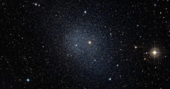
Elliptical galaxies: big and red, but not to be confused with buses. [Anglo-Australian Observatory]

The terminology here is not particularly imaginative: the principal difference between fast and slow rotators is, well, that the former rotate faster than the latter. But let us go into a bit more depth. Galaxies are collisionless systems, meaning that the gulf separating stars is sufficiently vast relative to their size that head-on collisions never happen in practice. Instead, all interactions are through gravity; stars whip around their host galaxy, their motions governed by its gravitational potential well. The orbits of the stars can be correlated, so that they are mostly orbiting around the same axis and in the same direction — or messy, with disordered orbits. Moreover, while all closed orbits are ellipses, there’s a big difference between a nearly circular orbit (like the Earth going around the Sun) and a highly elongated orbit (like that of a long-period comet). These extremes are sometimes respectively referred to as tangential and radial orbits.

If the orbits of stars in a galaxy are mostly correlated and tangential, the galaxy ends up as a flattened, more oblate rotating system. By contrast, disordered radial orbits give you blob-like systems without much rotation. In the first case, we might say that the system is ‘rotation supported’ (it doesn’t collapse down to a point under its own gravity because it’s rotating and can’t shed its angular momentum) and in the second that it is ‘pressure supported’ (stars falling in towards the centre are balanced by stars that have already passed through the centre and are now travelling outwards). This gets to the crux of the matter: most elliptical galaxies are rotation-supported fast rotators, but a significant fraction (about 15%) are pressure-supported slow rotators. The stark difference in their kinematics has led to suggestions that despite their apparent similarities, an alternate formation channel is required to create slow rotators.

Today’s Papers

In order to get to the bottom of this, the two teams conducted similar investigations. Both used data from large surveys of many galaxies, the MASSIVE survey and the SAMI galaxy survey respectively. Both surveys provide detailed spectroscopy of many galaxies — large samples are necessary since the aim is to draw statistical conclusions about the population of slow rotator galaxies as a whole. From this data, the kinematics of each target can be inferred (I explained how that works in some detail in a previous article, but it’s not essential to recap all that here).

Encouragingly, both studies hold some conclusions in common. As was already believed to be the case, both find that slow rotators are preferentially found among the most massive galaxies. Both teams looked at the effect of galaxy environment (i.e. whether the galaxy is isolated or contained in a cluster with many nearby neighbours). Massive galaxies do tend to be more commonly found in clusters, so given the dependence on mass already established such a trend must exist. What’s important is that when mass is controlled for there is no additional dependence on environment: both teams concur on this point.

Conclusions

Galaxies tend to grow via a series of mergers — collisions — between smaller galaxies, a process that takes place faster in dense environments where the chance of encountering another galaxy is much higher. This is the explanation for the point made above, that galaxies in clusters tend to be more massive than their isolated counterparts.

In the past it has been suggested that slow rotators might form due to a major collision between two similar sized galaxies, a highly disruptive event that would of course tend to leave behind a particularly massive galaxy. This kind of event would be much more common in the centre of a cluster of galaxies. However, neither of the studies presented here find strong evidence for a ‘special’ formation channel like this!

It’s certainly true that slow rotator galaxies tend to be particularly massive, but they don’t seem to care how they were put together (i.e. by many minor mergers or one big major merger): whether minor or major, galaxy mergers will tend to add mass and (usually) decrease the angular momentum of a galaxy. The more mergers that occur (i.e. the more massive a galaxy gets), the slower it will tend to rotate. In other words, fast rotators that grow large enough will eventually transition to become slow rotators instead.

About the author, Paddy Alton:

I am a fourth year PhD student at Durham University’s Centre for Extragalactic Astronomy, where I work with Dr John Lucey and Dr Russell Smith. My research is on the stellar populations of other galaxies — with a specific focus on those of the largest elliptical galaxies, whose stars formed under radically different conditions to those in our own Milky Way. I graduated in 2013 from the University of Cambridge with an MSci in Natural Sciences, having specialised in Astrophysics. Out of the office I enjoy a variety of sports, but particularly rowing (whenever Durham’s fickle river Wear allows it).

R136 observed with WFC3

Editor’s note: Astrobites is a graduate-student-run organization that digests astrophysical literature for undergraduate students. As part of the partnership between the AAS and astrobites, we repost astrobites content here at AAS Nova once a week. We hope you enjoy this post from astrobites; the original can be viewed at astrobites.org!

Title: Thermal Feedback in the High-mass Star and Cluster Forming Region W51
Authors: Adam Ginsburg, Ciriaco Goddi, J.M. Diederik Kruijssen, et al.
First Author’s Institution: National Radio Astronomy Observatory
Status: Accepted to ApJ, open access

Today let’s talk about massive stars! My favorite view of massive stars is the Hubble image of the star cluster R136 in the Large Magellanic Cloud, shown in cropped form in the cover photo above. All the blue shining spots in this picture are massive stars, with masses up to hundreds of solar masses that are million times brighter than the Sun! Massive stars bring beauty to our night skies, as well as structure to the universe. The Hubble image shows massive stars in their magnificent adulthood. But have you ever wondered what they looked like when they were still babies?

Figure 1. W51 as seen by the radio observatories ALMA and VLA. Images from radio observations are ‘false color’, meaning that the colors represent light that cannot be seen with naked eyes. Color scheme: blue is the carbon monoxide (CO) line, orange is the methanol (CH3OH) line, purple is the cyanoacetylene (HC3N) line, green is the radio continuum, and the white haze is free-free emission of ionized gas. [Ginsburg et al. 2017]

Indeed we know very little about their babyhood because baby massive stars are very far away and are usually blocked by opaque dust; to study their births we need observations at longer wavelengths. By looking at infrared (IR) wavelengths, we can study the dust that is heated by newly formed stars, which provides clues to the embedded stars. By studying radio line emission, we can see and trace the dense gas that comes before star formation. Lastly, the radio free-free continuum shows the compact ionized (HII) regions around young stars. Today’s paper does all these, looking into the high-mass star forming region W51 (shown in Figure 1) using ALMA. ALMA’s extraordinary angular resolution never ceases to amaze me. Today’s observations were done at ~0.2″ resolution — equivalent to telling two quarters apart at a distance of ~25 km (about ten standard airport runways placed back-to-back)!

The paper looks at three baby massive stars in W51: e2, e8, and North (Figure 1). These objects were chosen because of their strong star formation and the gas clouds have not been destroyed by supernova explosions, which are the key ingredients for understanding high-mass star formation. While the authors uncovered a wealth of information through their observations in the paper, here we focus on two main aspects: the temperature and ionization structures around the baby massive stars.

Figure 2. Temperature map around the hot core e2. This map was created using the molecular emission lines of methanol around the source. We see that the baby high-mass star heats up a large volume with a radius about 5,000 AU. [Ginsburg et al. 2017]

Figure 2 shows the temperature map of the dense gas around the baby massive star e2, created by modeling eight methanol emission lines. The main takeaway is that baby massive stars heat up a large volume of surrounding gas in their early formation phase, preventing gas from fragmenting and keeping the reservoir of gas available for star formation. The contour (blue line) in the temperature map encloses the region above 350 K, encompassing a region with radius ~5,000 AU. This temperature is much higher than the ~10 K typically observed in interstellar gas.

Figure 3. Image showing the highly excited warm molecular gas (colors) and the free-free radio emission from ionized gas (contours) around e2. The legend shows the nature of different colors. The absence of enhanced heating around the ionized region suggests that ionizing radiation has little effect on the dense molecular gas. [Ginsburg et al. 2017]

What about the ionization structure? Figure 3 shows the warm molecular gas (colors) and the ionized gas (contours) around e2. Again, the bright emission in colors shows that the baby stars are responsible for heating up the nearby dense gas. There are two key features:

  1. There is no enhanced heating of dense gas (brighter colors) around the ionized region (contours). The authors conclude that ionizing radiation from already-formed massive stars has little effect on the star-forming gas;
  2. The bright dust continuum emission (left blue blob) predicts strong ionizing radiation from the embedded baby stars, but the corresponding free-free emission (white contours) is not observed. The authors proposed an explanation: rapid accretion onto the growing stars bloats them and reduces their surface temperature, making them too cold to emit ionizing radiation. This is a big deal! The working of simultaneous gas infall and outward radiation feedback is extremely hard to model even with simulations and supercomputers. Today’s paper presents the first observational insight on what actually happens to growing massive stars!

Today’s paper is a pedagogical piece showcasing how bright scientists and next-generation observatories translate into new insights for future observations and simulations. These insights are necessary for us to understand how beautiful massive clusters like R136 came to be. Indeed, we expect the active star formation in the early universe behaved similarly to within forming massive clusters. Understanding how massive star clusters form therefore provides a unique basis to connect the cosmic history of star formation.

P.S. The first author of today’s paper is also an active developer of astronomy software — check out his Github page!

About the author, Benny Tsang:

I am a graduate student at the University of Texas at Austin working with Prof. Milos Milosavljevic. Using Texas-sized supercomputers and computer simulations, I focus on understanding the effects of radiation from stars when massive star clusters are being assembled. When I am not staring at computer screens, you will find me running around Austin, exploring this beautiful city.

hot Jupiter

Editor’s note: Astrobites is a graduate-student-run organization that digests astrophysical literature for undergraduate students. As part of the partnership between the AAS and astrobites, we repost astrobites content here at AAS Nova once a week. We hope you enjoy this post from astrobites; the original can be viewed at astrobites.org!

Title: Evidence for Two Hot Jupiter Formation Paths
Authors: Benjamin E. Nelson, Eric B. Ford, and Frederic A. Rasio
First Author’s Institution: Northwestern University
Status: Submitted to AJ, open access

Frolicking Through Fields of Data

The future of astronomy observations seems as bright as the night sky … and just as crowded! Over the next decade, several truly powerful telescopes are set to launch (read about a good number of them here and also here). That means we’re going to have a LOT of data on everything from black holes to galaxies, and beyond — and that’s in addition to the huge fields of data from the past decade that we’re already frolicking through now. It’s certainly far more data than any one astronomer (or even a group of astronomers) wants to analyze one-by-one; that’s why these days, astronomers turn more and more to the power of astrostatistics to characterize their data.

The authors of today’s astrobite had that goal in mind. They explored a widely-applicable, data-driven statistical method for distinguishing different populations in a sample of data. In a sentence, they took a large sample of hot Jupiters and used this technique to try and separate out different populations of hot Jupiters — based on how the planets were formed — within their sample. Let’s break down exactly what they did, and how they did it, in the next few sections!

Hot Jupiters Are Pretty Cool

First question: what’s a hot Jupiter, anyway?

They’re actually surprisingly well-named: essentially, they are gas-giant planets like Jupiter, but are much, much hotter. (Read all about them in previous astrobites, like this one and this other one!) Hot Jupiters orbit perilously close to their host stars — closer even than Mercury does in our own Solar System, for example. But it seems they don’t start out there. It’s more likely that these hot Jupiters formed out at several AU from their host stars, and then migrated inward into the much closer orbits from there.

Figure 1: A gorgeous artist’s impression of a hot Jupiter orbiting around its host star. [ESO/L. Calçada]

As to why hot Jupiters migrate inward … well, it’s still unclear. Today’s authors focused on two migration pathways that could lead to two distinct populations of hot Jupiters in their sample. These migration theories, as well as what the minimum allowed distance to the host star (the famous Roche separation distance, aRoche) would be in each case, are as follows:

  • Disk migration: hot Jupiters interact with their surrounding protoplanetary disk, and these interactions push their orbits inward. In this context, aRoche corresponds to the minimum distance that a hot Jupiter could orbit before its host star either (1) stripped away all of the planet’s gas or (2) ripped the planet apart.
  • Eccentric migration: hot Jupiters start out on very eccentric (as in, more elliptical than circular) orbits, and eventually their orbits morph into circular orbits of distance 2aRoche. In this context, aRoche refers to the minimum distance that a hot Jupiter could orbit before the host star pulled away too much mass from the planet.

The authors defined a parameter ‘x’ for a given hot Jupiter to be x = a/aRoche, where ‘a’ is the planet’s observed semi-major axis. Based on the minimum distances in the above theories, we could predict that hot Jupiters that underwent disk migration would have a minimum x-value of x = aRoche/aRoche = 1. On the other hand, hot Jupiters that underwent eccentric migration would instead have a minimum x-value of x = 2aRoche/aRoche = 2. This x for a given planet is proportional to the planet’s orbital period ‘P’, its radius ‘R’, and its mass ‘M’ in the following way:

x = a/aRoche ~ P2/3M1/3R-1

And this x served as a key parameter in the authors’ statistical models!

Toying with Bayesian Statistics

Next question: how did today’s authors statistically model their data?

Figure 2: Probability distribution of x for each observation group, assuming that each hot Jupiter orbit was observed along the edge (like looking at the thin edge of a DVD). The bottom panel zooms in on the top one. Note how the samples have different minimum values! [Nelson et al. 2017]

Short answer: with Bayesian statistics. Basically, the authors modeled how the parameter x is distributed within their planet sample with truncated power laws — so, x raised to some power, cut off between minimum and maximum x values. They split their sample of planets into two groups, based on the telescope and technique used to observe the planets: “RV+Kepler” and “HAT+WASP”. Figure 2 displays the distribution of x for each of the subgroups.

The authors then used the Markov Chain Monte Carlo method (aka, MCMC; see the Bayesian statistics link above) to explore what sort of values of the power laws’ powers and cutoffs would well represent their data. Based on their chosen model form, they found that the RV+Kepler sample fit well with their model relating to eccentric migration. On the other hand, they found evidence that the HAT+WASP sample could be split into two populations: about 15% of those planets corresponded to disk migration, while the other 85% or so corresponded to eccentric migration.

Remember that a major goal of today’s authors was to see if they could use this statistical approach to distinguish between planet populations in their sample … and in that endeavor, they were successful! The authors were thus optimistic about using this statistical technique for a much larger sample of hot Jupiters in the future, as oodles of data stream in from telescopes and surveys like KELT, TESS, and WFIRST over the next couple of decades.

Their success joins the swelling toolbox of astrostatistics … and just in time! Telescopes of the present and very-near future are going to flood our computers with data — so unless we’re willing to examine every bright spot we observe in the sky by hand, we’ll need all the help from statistics that we can get!

About the author, Jamila Pegues:

Hi there! I’m a 1st-year grad student at Harvard. I focus on the evolution of protoplanetary disks and extrasolar systems. I like using chemical/structural modeling and theory to explain what we see in observations. I’m also interested in artificial intelligence; I like trying to model processes of decision-making and utility with equations and algorithms. Outside of research, I enjoy running, cooking, reading stuff, and playing board/video games with friends. Fun fact: I write trashy sci-fi novels! Stay tuned — maybe I’ll actually publish one someday!

first stars

Editor’s note: Astrobites is a graduate-student-run organization that digests astrophysical literature for undergraduate students. As part of the partnership between the AAS and astrobites, we repost astrobites content here at AAS Nova once a week. We hope you enjoy this post from astrobites; the original can be viewed at astrobites.org!

Title: Modeling of Lyman-Alpha Emitting Galaxies and Ionized Bubbles at the Era of Reionization
Authors: Hidenobu Yajima, Kazuyuki Sugimura, Kenji Hasegawa
First Author’s Institution: Tohoku University, Sendai, Miyagi, Japan
Status: Submitted to ApJ, open access

About four hundred thousand years after the Big Bang, the universe settled into a pretty dull period in its history. There were no stars or galaxies, just one massive expanse of neutral hydrogen, sitting in the dark. This period in the universe’s history, known appropriately as the Dark Ages, came abruptly to an end when the first stars were born and began to shine, dumping loads of high-energy photons into their surroundings. These photons created ‘bubbles’ of ionised hydrogen around the stars, which slowly grew as more photons were pumped out by the stars. The bubbles surrounding the first stars were pretty small, but later, as stars began to group together into the first galaxies, these bubbles were blown much bigger by the combined photons from all the stars in the galaxy. Over time the bubbles from neighbouring galaxies began to overlap, until eventually all of the hydrogen in the universe was ionised (see Figure 1). This process is known as reionisation (Astrobites has written plenty about reionisation in the past; for more background, go check out some of these articles), and it’s a key period in the universe’s history.

The subject of today’s bite are these ionised bubbles, the baby galaxies that blew them, and how much they contributed to reionisation. We will see that there is a close relationship between the properties of a galaxy and the size of the bubble it can blow. The size of the bubble also affects how easily we can see the galaxy. Finally, we’ll also learn about two upcoming observatories that will hopefully be able to see both the bubbles and their galaxies at earlier times than ever before.

reionisation timeline

Figure 1: A timeline showing the beginning of the Dark Ages (at recombination), and its end when the first stars and galaxies were born, ionising nearby hydrogen. These ionised bubbles soon grow and overlap, until the majority of the Hydrogen in the universe is ionised; this period is known as the Epoch of Reionisation [Nature 468].

Who blew all the bubbles?

One burning question researchers would like answered is ‘What kinds of galaxies contributed the most to reionisation?’ Many researchers in the field assert that it was small galaxies; they tend to allow their ionising photons to escape much easier than massive galaxies as they have less gas to get in the way. There are also far more small galaxies than big ones: more galaxies, more high-energy photons, more reionisation! Unfortunately, such small galaxies are typically harder to detect than their big cousins since they’re less luminous.

bubble size

Figure 2: Size of ionised hydrogen bubbles (RHII) plotted against the luminosity of the Lyman-alpha emission (LLyα). The bigger the bubble, the stronger the emission. This relationship doesn’t change much with redshift.

That’s not to say that finding small galaxies is impossible. In the early universe, galaxies tend to be creating lots of new stars, and these young stellar populations emit light with a strong hydrogen spectral line, known as Lyman-alpha. Using Lyman-alpha, astronomers hope to be able to see the small galaxies that contribute to reionisation in a big way.

Unfortunately, as it’s so energetic, Lyman-alpha radiation is absorbed by neutral hydrogen. So how can we detect it from before the universe was ionised? The trick is to choose galaxies that have blown large bubbles. Galaxies with large enough bubbles allow any newly emitted ionising radiation from the galaxy to travel far enough uninhibited through the bubble to become redshifted. Redshifted Lyman-alpha radiation doesn’t have enough energy to ionise the neutral hydrogen outside the bubble, so it can happily continue travelling all the way to our telescopes on Earth, 12 billion light-years away.

So now the question is, what galaxies blow the biggest bubbles? The authors of today’s paper use a simulated model of the early universe to investigate this. Figure 2 shows the predicted size of ionised bubbles against the luminosity of Lyman-alpha. There’s a strong correlation between bubble size and luminosity. So … what galaxies emit the most Lyman-alpha? The bottom left panel of Figure 3 shows the relationship between Lyman-alpha luminosity and stellar mass. There is a clear correlation between the size of a galaxy and the amount of Lyman-alpha radiation it’s pumping out.

ly-alpha strength against stellar mass

Figure 3: The relationships between bubble size and Lyman-alpha luminosity (y axis, top and bottom respectively) with stellar mass and star formation rate (x axis, left and right respectively). The different coloured lines are for different redshifts. The biggest galaxies emit the most Lyman-alpha, and therefore blow the biggest bubbles. The link between bubble size and star formation rate is not as strong.

What does this all tell us? For a start, the model seems to suggest that we won’t be able to see the very smallest galaxies at very high redshifts using Lyman-alpha. All is not lost, however: thanks to two upcoming observatories, we may still be able to see the most energetic Lyman-alpha emitting galaxies and their bubbles at redshifts of around z ~ 10, much higher than we’ve ever seen them before (The most distant Lyman-alpha emitter found to date is at z ~ 8.6).

The first of these new observatories will be the James Webb Space Telescope (JWST), an enormous space-based telescope scheduled to launch in 2018. It will be capable of detecting Lyman-alpha radiation out to very high redshifts: the horizontal line in Figure 2 shows the expected sensitivity of the instrument, within range of the most luminous Lyman-alpha emitters at z ~ 10 according to the model.  

The second of these enormous observatories to come online will be the Square Kilometer Array (SKA), a truly enormous radio telescope array based in both South Africa and Australia. It will be able to ‘see’ neutral hydrogen, leaving the ionised hydrogen bubbles to stand out like holes in a cheese. The vertical dashed line in Figure 2 shows the smallest bubble size that it’s hoped the SKA will be able to see, again well within the range of the biggest bubbles at ~ 10.

Combining these observatories, the yellow region in Figure 2 represents those galaxies with bubbles are that are big enough to be observed with the SKA, and that allow enough Lyman-alpha escape to be picked out by JWST. If the model is correct, these will be the most distant Lyman-alpha emitters observed, and the first-ever detection of ionised bubbles. But the smaller galaxies, thought to be responsible for the majority of reionisation, will have to wait for future generations of humongous space- and ground-based telescopes to be detected.

About the author, Christopher Lovell:

I’m a 2nd year postgrad at the University of Sussex. I model high redshift galaxies using hydrodynamical simulations. When I’m not reading for work I read for pleasure, mostly science fiction and history, and when I’m not reading I enjoy dodging London traffic on my bike.

computers

Editor’s note: Astrobites is a graduate-student-run organization that digests astrophysical literature for undergraduate students. As part of the partnership between the AAS and astrobites, we repost astrobites content here at AAS Nova once a week. We hope you enjoy this post from astrobites; the original can be viewed at astrobites.org!

Title: A machine learns to predict the stability of tightly packed planetary systems
Authors: Daniel Tamayo, Ari Silburt, Diana Valencia et al.
First Author’s Institution: University of Toronto at Scarborough, Canada
Status: Published in ApJL, open access

Scientists are impatient people. Nobody has time to make an entire universe and watch it evolve for thirteen billion years to see what happens (do you have any idea how many emails you could answer in thirteen billion years?!), so instead, scientists simulate a smaller version that only takes a few months to mature.* Nobody has time to comb by hand through four years’ worth of Kepler telescope data to look for telltale planet shadows, so instead, scientists write a computer program that finds planets automatically. Nobody has time to manually rearrange the inside of a telescope to observe new stuff every five minutes, so scientists build robots to do it instead.

All of the above strategies work because computers are much faster than humans at doing small, repetitive tasks. But sometimes, even computers are too slow. For example, predicting the fate of a set of planets orbiting around a star can take a computer a couple of weeks. Nothing the computer is doing is complicated — it’s just tracking the motions of the planets and the star, subject to each others’ gravity. But it has to calculate the gravitational forces in question trillions of times, and, as former Federal Reserve Chair Alan Greenspan likes to say, trillions is lots.

Today’s authors wondered: is there a faster way to figure out what will happen to those planets?

Stable or Not?

“What will happen?” is kind of a broad question, and broad questions don’t lend themselves to speedy answers. So the authors decided to take their essay prompt and turn it into a true-or-false: will a given set of planets remain stable for a long time, or not? (“Or not” encompasses a few possibilities — maybe two of the planets collide with each other, or one crashes into the star, or one gets kicked out of the system entirely.)

Planetary scientists care about stability in their planet simulations because it’s a way of checking that the simulations match reality. Stable planetary systems last a long time, and unstable systems fall apart quickly. The odds of seeing an unstable exoplanetary system in real life are slim, just like the odds of looking up from your desk and catching your coworker mid-spilling coffee on his keyboard. So if you’re trying to match your simulation to a real-life, observed system of planets, your simulation should probably be stable.

An Answer Key

So how did the authors get a quick answer to “stable or not?” They handed their computer a practice test with an answer key. The practice test was a set of 5,000 three-planet systems for which they had already run a full-blown, weeks-long simulation to test for stability, so they had answers (“stable” or “unstable”) in hand. The computer’s job was to take those 5,000 systems, together with their answers, and look for patterns: do the stable systems have things in common? Are there clues in the properties of the planets that hint that a system will ultimately be stable?

They gave the computer some time to study this data, and then they tested its performance on a new set of planetary systems it had never seen before. If the computer did well, they reasoned, then they could dispense with time-consuming stability simulations in the future and just rely on the computer’s predictions. If the computer did poorly, well, then back to test prep.

What to Study

First, they only let the computer search for patterns in the bare minimum of data necessary to describe the planets — the shapes of their orbits, their distances from the star, and their distances from each other. These numbers are the equivalent of a stick-figure sketch of each planetary system. The computer did okay with this information, but it was never very confident in assigning an answer of “stable” (see Figure 1, top panel).

So they decided to help the computer out some more: instead of giving it just a bare-bones description of each system, they let it see the results of a short simulation of the planets’ orbits (one that only ran for a few minutes, instead of weeks). The bottom panel of Figure 1 shows the results: major improvement! The computer did much better at confidently sorting the unstable and stable systems.

Well done, computer!

Figure 1: The computer’s test results, given either a bare-bones description of each planetary system (upper panel) or the results of a short stability simulation (lower panel). The colors indicate the correct answer: green means that the systems are genuinely stable, and blue means unstable. “Predicted probability” on the x-axis indicates the computer’s certainty — a value close to 0 means the computer is confident that the system is unstable, and a value close to 1 means the computer is confident the system is stable. A value in the middle indicates that the computer was uncertain. To get an A+ on this test, the computer would have to predict 0 for every blue system and 1 for every green system.

What Does It Mean?

This result isn’t just a cool demonstration of computers’ ability to learn and predict on their own. It also gives us some new insight into what makes planetary systems stable or unstable. The authors investigated why the computer made the predictions it did, and noticed that strong variation in the middle planet’s distance from the star — resulting from the three planets tugging on each other gravitationally — was a good clue that the system would ultimately lose stability. Impatience gets results!

*When run on a couple of the world’s most powerful supercomputers, working together.

About the author, Emily Sandford:

I’m a PhD student in the Cool Worlds research group at Columbia University. I’m interested in exoplanet transit surveys. For my thesis project, I intend to eat the Kepler space telescope and absorb its strength.

Abell 1689

Editor’s note: Astrobites is a graduate-student-run organization that digests astrophysical literature for undergraduate students. As part of the partnership between the AAS and astrobites, we repost astrobites content here at AAS Nova once a week. We hope you enjoy this post from astrobites; the original can be viewed at astrobites.org!

Title: The Remarkable Similarity of Massive Galaxy Clusters from z~0 to z~1.9
Authors: Michael McDonald, Steve W. Allen, Matt Bayliss et al.
First Author’s Institution: Kavli Institute for Astrophysics and Space Research, MIT
Status: Submitted to ApJ, open access

Introducing … Galaxy Clusters and X-Rays!

We have come a long way since the 1930s, when the words ‘galaxy cluster‘ were posited for the first time by Fritz Zwicky in relation with the presence of dark matter in the Coma cluster. Developments in multi-wavelength astrophysics have allowed us to probe different components of a cluster with different telescopes. For example, star-forming galaxies of galaxy clusters are observed using optical telescopes because starlight in these galaxies loves emitting photons with the roughly the same energy as that which we see from the Sun. Other galaxies are super-red, have no star-formation, and have a ton of dust; these are best viewed with infrared and radio telescopes. Today’s story takes us to the intermittent space between different galaxies inside a cluster — called the intracluster medium (ICM) — and its emissions.

The ICM of a galaxy cluster is filled with gas or plasma that comprise free electrons and protons. This medium reaches temperatures of the order of 107 to 108 K, and it emits light in the form of X-rays due to a phenomenon called free-free emission of electrons, or Bremsstrahlung. X-ray observations of galaxy clusters are a crucial element for understanding how the cluster gas evolves with time, and how it influences the formation and evolution of massive galaxies in clusters. Moreover, the effect of active galactic nuclei (AGN) that heat up cluster environments after firing up from individual member galaxies can also be analyzed through X-ray studies, using telescopes like XMM-Newton and Chandra.

Looking for Distant Galaxy Clusters

Fig 1. Picture of an SPT Cosmic Microwave Background (CMB) map. This is a small patch of 50 sq. degrees with CMB anisotropies seen clearly. Small bright point sources are dusty galaxies that come out in these maps. Similarly, the dark spots are shadows on the CMB caused by inverse-comptonization of CMB photons by galaxy clusters. [Bradford Benson (Fermilab, University of Chicago)]

This is easier said than done. We know a lot about close-by galaxy clusters by pointing an X-ray telescope to the sky, but finding X-ray emitting clusters that are extremely far away is a tough job. This was made easy by the advent of sub-mm (or CMB) telescopes, like the South Pole Telescope (SPT) or Planck. These telescopes discover galaxy clusters that cast a shadow on the background CMB, by a phenomena called the Sunyaev-Z’eldovich effect (look at this bite for details!). This makes cluster detection in CMB telescopes a distance- (or redshift-) independent activity, which gives us a better look at faraway clusters.

Let’s make this slightly easier on us. If I were to summarize my chain of thought in the last two paragraphs, I would do so with the following steps:

  1. Study the CMB and look for shadows in the maps. These shadows are galaxy clusters that are distorting the background CMB light.
  2. Use an X-ray telescope to point to these shadows; you will see the X-ray ICM gas of these clusters.
  3. Make a list of these clusters, and study the X-ray ICM gas as a function of their distance, or redshift.
  4. Party.

Today’s paper is exactly that!

Evolution of the ICM

Fig 2. Plotted here is mass of cluster vs. redshift for the clusters considered in today’s paper. The orange background is an evolution map, incorporating the physics of galaxy cluster evolution. This implies that clusters at high redshift (the black stars) could very well be the ancestors of nearby clusters (the blue squares), which are much more massive and fall within the orange band.

McDonald et al. present the first ever X-ray analysis of 8 galaxy clusters (with masses of ~2 to 4 x 10¹⁴ solar masses) at redshifts greater than z = 1.2 that were detected with the SPT telescope. These add to the thermodynamic studies done by the same collaboration for low-redshift (nearby) clusters, allowing them to discuss the evolution of cluster ICM from redshifts of z = 1.9 to 0 — i.e., from a time when the universe was 3 billion years old, to now! What they are looking for are signs of similarity between distant and nearby clusters: not just looking alike, but whether distant clusters are younger versions of the nearby clusters. We call this property self-similarity — young, less massive clusters accrete matter, cool down and evolve into massive clusters.

The authors find that centres of clusters, called cool cores, show no significant evolution in the density of the ICM gas when comparing distant clusters with close ones. As we go further out — about 20% of the ‘defined’ cluster radii — we see that faraway and nearby clusters have self-similar densities. Based on their analysis, the authors propose a scenario where the cool cores formed at redshifts of > 1.5 and their size, mass and density roughly remained constant. The rest of the cluster around them merrily continued accreting matter, and grew in their size and mass. This is possible if there is a gigantic AGN at the centre of these clusters that reheats all the cool gas that would otherwise have fallen to the centre of these clusters. This cooling and reheating seems to be tightly regulated, just like a thermostat on a fixed temperature. This explains the preservation of density around the cool cores, but not the rest of the massive cluster.

Fig 3. (a) Absolute gas density as a function of radius for the 8 new galaxy clusters studied in today’s paper. At low radii, i.e. near centre of clusters, there is considerable difference in the density profiles, with a big scatter. As one goes outwards, the outskirts of the clusters look remarkably self-similar. (b) A similar result is seen when comparing clusters across different redshifts (or epochs).

Wait … what?!

This is huge. The work in today’s paper indicates that faraway clusters could very well be progenitors to nearby clusters, if given enough time to evolve into massive structures. The cluster centres seem to stand the test of time, unfazed by the chaos around them. This is irrespective of how disturbed or relaxed the shapes of these clusters are, or how many galaxies are merging into these clusters.

Fig 4. Photon asymmetry (a tracer of disturbance in the clusters) vs electron density in galaxy clusters considered in today’s paper. The black stars are the 8 new clusters added to the analysis sample. This plot shows that there is no bias in the new sample, and the clusters span the typical range of these numbers, distributed uniformly.

A study like this makes us reach regimes where we can connect the physics of central cluster environments to their macro-surroundings — a connection that’s especially challenging to replicate in hydrodynamical simulations at the moment. With the advent of new X-ray, CMB and optical telescopes, the precision with which we can make these claims only gets better!

About the author, Gourav Khullar:

Grad student at UChicago. I look at the fantastic phenomenon engulfing galaxy clusters that is gravitational lensing. If that sounds cheesy and/or weird, wait till you hear me talk about science, chocolate chip muffins and comic books.

J0416

Editor’s note: Astrobites is a graduate-student-run organization that digests astrophysical literature for undergraduate students. As part of the partnership between the AAS and astrobites, we repost astrobites content here at AAS Nova once a week. We hope you enjoy this post from astrobites; the original can be viewed at astrobites.org!

Title: Magnifying the Early Episodes of Star Formation: Super-star clusters at Cosmological Distances
Authors: E. Vanzella et al.
First Author’s Institution: INAF–Osservatorio Astronomico di Bologna
Status: Submitted to ApJL, open access


Have another look at the cover image, which depicts the Hubble Frontier Fields of the galaxy cluster MACS J0416. It always amazes me to see the manifestation of gravitational lensing in deep Hubble images — light from very-far-away galaxies being magnified and stretched into arcs by the strong gravity of the quite-far-away galaxy clusters. The gravity of the galaxy clusters acts as a “natural telescope” that focuses light to reveal background galaxies, which otherwise are too faint to be seen.

Astrophysicists have been puzzling over the mystery of reionization. How did reionization occur and what sources caused it? To try to answer these questions we need to know the origins and the properties of the early, far-away galaxies that were responsible. Recently, it was found that the huge number of faint galaxies may provide enough photons to reionize the universe. The technique of gravitational lensing comes in very handy because it allows far-away and faint objects to be observed!

Directly observing galaxies during reionization (with redshift z > 6) is hard. They are extremely faint and the strong characteristic spectral lines lie outside the limits of our detectors (no worries, JWST will come to rescue!) One way astrophysicists get around this problem is to study objects with slightly lower redshifts at z ~ 3, which are the younger analogs of the sources that reionized the universe. Today’s paper follows this approach.

Typically gravitational lensing reveals far-away galaxies. Today’s story is extraordinary: the authors managed to unravel two star clusters at redshift z = 3.2 by the lensing technique, and derived important hints about the ionization history of the universe.

Hubble insets

Figure 1. HST color image of the galaxy cluster MACS J0416 (middle section of the cover image.) The insets show the six images of the object ID14 (marked a to f). The annotated numbers are the magnitudes of each component. [Adapted from Vanzella et al. 2017]

OK, let’s get into the beautiful observations. Figure 1 shows the the middle section of the cover image, again centered at the galaxy cluster J0416. The insets (Image 1, 2, and 3) are the multiple images of the object ID14 generated by the gravity of J0416. Image 1 is further magnified into four additional images — ID14a, b, c, and d — by the elliptical galaxy pair E1 and E2 (ID14 is therefore called a doubly lensed system). Each ID14 image has two components, marked “1” and “2”.

MUSE spectra

Figure 2. Spectra of ID14 taken by the MUSE instrument of the Very Large Telescope. The colors of the spectra denote contributions from different images (black is sum of ID14a, b, and c; red is ID14b and c; blue is ID14a only). The main features are the strong metal lines and the weak Lyman-alpha line. [Adapted from Vanzella et al. 2017]

Spectra of ID14 are shown in Figure 2, with different colors representing contributions from different images. The magenta spectrum is taken from a Lyman-alpha emitting region ~2.1 kpc away from ID14 at the same redshift (magenta ellipse, Figure 3). There are two main points to take away: first, there are multiple strong high ionization lines (from highly ionized atoms He+, C2+, C3+, O2+) characteristic for energetic ionized environments; second, there is a weak Lyman-alpha emitting region not too far from ID14.

Figure 3. Image showing the Lyman-alpha emitting cloud (magenta ellipse) near ID14a, b, and c (black arc). The separation is estimated to be ~2 kpc. [Adapted from Vanzella et al. 2017]

By analyzing the images in Figure 1, the authors find that the source ID14 comprises two compact systems with sizes of ~30 pc each, separated by ~300 pc. Also, the line ratios measured from the spectra (Figure 2) are consistent with a stellar population. Further modeling of additional spectra gives a mass estimate of 106–107 solar masses. These suggest that ID14 consists of two ancient, compact, young, and massive star clusters — commonly referred to as super star clusters.

It is intriguing to see star clusters so far away. What’s more? ID14 also hints at the structure of ionizing radiation in the early universe! With the observed Hβ spectral line (not shown, see Figure 3 of the original paper), the Lyman-alpha line is predicted to be >150 times brighter than currently observed. Such deficiency can be explained by (1) dust absorption and (2) Lyman-alpha photons being scattered out of the observer’s line of sight by irregular distributions of gas. The authors proposed a plausible picture where ionizing radiation escapes the star clusters and hits the neutral cloud nearby, where we see the Lyman-alpha emission in fluorescence (Figure 3). This finding suggests that direction-dependent visibility of ionizing radiation observed on galactic scales could also prevail on the scale of star clusters.

We astrophysicists are cosmic detectives. By combining our advanced telescopes with the natural gravitational lenses, we are able to grasp information that would otherwise be out of reach. Today’s story highlights that reionization is really an incredibly complex problem, one that connects tiny star clusters to the scale of the cosmos. More and better observations will further constrain the properties of the ionizing sources and help us uncover the process of reionization!

About the author, Benny Tsang:

I am a graduate student at the University of Texas at Austin working with Prof. Milos Milosavljevic. Using Texas-sized supercomputers and computer simulations, I focus on understanding the effects of radiation from stars when massive star clusters are being assembled. When I am not staring at computer screens, you will find me running around Austin, exploring this beautiful city.

volcano

Editor’s note: Astrobites is a graduate-student-run organization that digests astrophysical literature for undergraduate students. As part of the partnership between the AAS and astrobites, we repost astrobites content here at AAS Nova once a week. We hope you enjoy this post from astrobites; the original can be viewed at astrobites.org!

Title: A Volcanic Hydrogen Habitable Zone
Authors: Ramses Ramirez and Lisa Kaltenegger
First Author’s Institution: Cornell University
Status: Published in ApJL, open access

The search for life beyond the solar system has long focused on the habitable zone (HZ). This is the region around a star where a planet with the right properties could maintain liquid water on its surface for a substantial period of time. The classical inner edge of the HZ is set using the runaway greenhouse effect, in which a positive feedback loop causes oceans to evaporate, creating an oven-like world similar to Venus. The classical outer edge of the HZ is set using the maximum greenhouse effect from carbon dioxide, which is the distance at which adding carbon dioxide to a planet’s atmosphere starts cooling the planet (due to scattering the light or condensation). There have been many other calculations of the HZ edges using different assumptions, such as a nearly desert planet and planets with different masses. In this paper, the authors try to use volcanoes to expand the edges of the HZ. They calculate the HZ edges for atmospheres with significant amounts of hydrogen gas produced by volcanoes, another powerful greenhouse gas.

Hydrogen-Induced Greenhouse Warming

An atmosphere with significant greenhouse warming due to hydrogen is difficult to maintain, because hydrogen gas escapes atmospheres quickly. However, early in the Earth and Martian geological histories, volcanic outgassing of hydrogen may have exceeded atmospheric escape of hydrogen. This means that both planets might have had significant amounts of hydrogen in their atmosphere. Different conditions in the mantle could make this hydrogen outgassing occur over a much longer timescale and therefore give the planet a longer hydrogen-induced greenhouse effect. Using this volcanic outgassing as their source of hydrogen, the authors used a 1D atmospheric climate model to compute the edges of the HZ for an atmosphere composed of nitrogen, water vapor, carbon dioxide, and hydrogen for stars with temperatures between 2,600 K and 10,000 K. A variety of atmospheric concentrations were tested up to 50% hydrogen (30% hydrogen is the highest concentration they could reasonably acquire by assuming different geologies, but 50% was included as an extreme outlier). Because these models depended on so many variables, many assumptions were necessary in the model too, such as plate tectonics, the carbon-silicate cycle, an oxygen-reduced (i.e., oxygen-poor) mantle, and a constant albedo.

New Habitable Zone Results

Adding hydrogen into planetary atmospheres moved both the inner and outer edges of the HZ outward. The outer edge moved farther than the inner edge, which widened the HZ. The incident stellar flux (the amount of energy hitting the planet per second per square meter) needed to maintain liquid water on the surface at the outer edge of the HZ decreased by 25%, 44%, and 52% when the atmosphere was 5%, 30%, and 50% hydrogen, respectively. This moved the classical HZ edge from 1.67 AU to 1.94 AU, 2.23 AU, and 2.4 AU, respectively. The HZ expanded much more for the hotter stars than the cooler stars. The inner edge of the HZ, on the other hand, shifted only a tiny bit: 0.1% outward for 1% hydrogen and 4% outward for 50% hydrogen.

Figure 1: The outer edge of the habitable zone. The x-axis is the amount of energy received from the star per second per area, and the y-axis is the temperature of the star. The stellar temperature is important because it changes the distribution of energy hitting the planet (e.g., a higher proportion of the incident energy is in the infrared as the stellar temperature decreases). The dashed line is the classical outer edge of the HZ. The solid line is the empirical outer edge using evidence suggesting that early Mars had liquid oceans. The red lines are the outer edges of the HZ for atmospheres with different concentrations of hydrogen. For reference, the Sun’s effective temperature is 5,780 K (where Mars is).

Conclusions

It is expected that terrestrial planets are born with oxygen-reduced mantles. A planet with a reduced mantle is more likely to have an extended period of hydrogen outgassing and therefore a longer hydrogen-induced greenhouse effect. Over time, however, the mantles become oxidized. Some research has suggested that smaller planets’ mantles (like Mars’s) stay reduced, while larger planets’ mantles oxidize quickly. This suggests that hydrogen outgassing might only be relevant for smaller planets. On the other hand, more massive planets can hold onto hydrogen more easily due to their gravity and higher likelihood to have a strong magnetic field. The relationship between planetary mass and the effectiveness of hydrogen outgassing on habitability remains unclear.

In our own solar system, Earth’s mantle may have become oxidized only about 100 million years after formation. Mars’s mantle, though, may have stayed reduced for a billion years. Two meteorites (called ALH84001 and NWA Black Beauty) from 4 billion years ago support this idea. Therefore, hydrogen outgassing from volcanoes could have contributed to a warm, wet, early Mars.

About the author, Joseph Schmitt:

I’m a 5th year graduate student at Yale University. My main research is on the discovery, characterization, and statistics of exoplanets. I’m also one of the science leads on the citizen science project Planet Hunters, a website where the general public can join the search for exoplanets.

Titan

Editor’s note: Astrobites is a graduate-student-run organization that digests astrophysical literature for undergraduate students. As part of the partnership between the AAS and astrobites, we repost astrobites content here at AAS Nova once a week. We hope you enjoy this post from astrobites; the original can be viewed at astrobites.org!

Title: Compositional Similarities and Distinctions Between Titan’s Evaporitic Terrains
Authors: S.M. MacKenzie and Jason W. Barnes
First Author’s Institution: University of Idaho
Status: Published in ApJ, open access

Titan, Saturn’s largest moon, is the only solar system object other than the Earth to have a thick atmosphere and standing surface liquid. When the Cassini spacecraft began observing Titan, it even discovered lakes and seas dotting the northern hemisphere. Don’t fire up your rocket just yet, though — because Titan is so cold, the lakes and seas are filled with liquid methane and ethane rather than water.

Cassini

Artist’s illustration of the Cassini mission at Saturn. [NASA]

Titan’s thick, methane-rich atmosphere makes it difficult to observe the surface at visible wavelengths. Luckily, there are several windows in the near-infrared through which light can pass and reveal the surface. Seven of these windows overlap with the wavelength range covered by Cassini’s Visual and Infrared Mapping Spectrometer (VIMS). By looking at how the brightness of the surface changes with wavelength, we can learn about the composition of the surface material. The cover photo above depicts a three-color map of Titan’s surface made with VIMS. The pinkish regions show where the surface reflects strongly at 5 microns.

The 5-micron-bright regions are found circling lakes in the northern hemisphere, in dry lake beds in both hemispheres, and in the desert-like equatorial regions. The bright rings around the lakes are believed to be evaporites—solid material left behind after the liquid in which it was dissolved evaporates. This explains the presence of the bright material surrounding the lakes and the dry lake beds, but what about the desert? Linking 5-micron-bright regions in what is today a desert to the bright rings around the lakes could provide evidence that the equatorial regions of Titan were once covered with liquid.

In this paper, the authors searched for a compositional link between the bright regions in the desert and the evaporites around the lakes and seas. They used an absorption feature at 4.92 microns in order to investigate whether or not the 5-micron-bright material in each of these regions is the same. The 4.92-micron absorption feature has been observed previously in the desert region, but no one has been able to definitively say what compound causes it. Because of this, finding the same feature in the desert and around the lakes can indicate that the regions are geologically similar, but can’t yet tell us about the chemical makeup of the material.

VIMS data

A non-projected version of the VIMS map of Titan shown above. [JPL/NASA/Univ. of Arizona/CNRS/LPGNantes]

The authors used Principal Component Analysis (PCA) to isolate the weak 4.92-micron absorption feature. PCA is a mathematical method that separates the individual components that make up an observed signal. In this case, the main contributors to the signal (i.e. the “principal components”) could be changes in the surface reflectivity, instrumental noise, or compositional variations. Once the components have been separated, the unwanted contributors can be removed. As a result, PCA can be used to isolate a signal that is much smaller than the background noise. (PCA is also used in the direct detection of exoplanets and is described in more detail here.) After applying PCA, the authors observed the 4.92-micron absorption feature in both the desert and around the lakes, strengthening the hypothesis that the desert once had liquid. However, they also found that not all of the lake regions had the absorption feature, and some of the regions that did have it didn’t have it in every observation. They suggested that material with a crystalline structure that reflects light more strongly at some angles or transient effects like methane rain could cause the absorption feature to appear intermittently.

What causes some lake regions to have the absorption feature while others don’t? The authors suggested that the material that causes the 4.92-micron absorption feature could be just one of several solids that are left behind as the lakes evaporate away. Whether or not a lake rim has the absorption feature could be a function of how far the evaporation has progressed. As evaporation proceeds, materials that are more soluble precipitate out in sequence. We could see a 5-micron-bright evaporite ring without the absorption feature if the lake hasn’t evaporated enough for the material causing the absorption to precipitate out. The authors even have a suggestion for why this might happen to some lakes in the northern hemisphere but not others—lakes closest to the north pole might experience more methane rainfall than more southern lagoons, periodically halting the evaporation before the absorbing material can crystallize.

Although the authors posit many explanations for the mysterious behavior of the 4.92-micron absorption feature, they can’t yet settle on one cause. It’s not surprising that Titan, an inhospitable but strangely familiar world with complex geology and weather systems, presents a challenge to astronomers. In the future, by modeling how Titan’s climate changes over time, we can hope to learn more about what causes the distribution of evaporites on Titan’s surface.

About the author, Kerrin Hensley:

I am a second year graduate student at Boston University, where I study the upper atmospheres and ionospheres of Venus and Mars. I’m especially interested in how the ionospheres of these planets change as the Sun proceeds through its solar activity cycle and what this can tell us about the ionospheres of planets around other stars. Outside of grad school, you can find me rock climbing, drawing, or exploring Boston.

1 33 34 35 36 37 38