Seeing Double: Binary Stars in Dwarf Galaxies
Editor’s note: Astrobites is a graduate-student-run organization that digests astrophysical literature for undergraduate students. As part of the partnership between the AAS and astrobites, we occasionally repost astrobites content here at AAS Nova. We hope you enjoy this post from astrobites; the original can be viewed at astrobites.org.
Title: The Binary Fraction of Stars in Dwarf Galaxies: the Cases of Draco and Ursa Minor
Author: Meghin Spencer et al.
First Author’s Institution: University of Michigan, Ann Arbor
Status: Published in AJ
Disclaimer: My advisor is an author on this paper, but somehow I didn’t realize that until after I’d finished writing the entire post. Hopefully you’ll forgive my compromised journalistic integrity! –Mia de los Reyes
Introduction
Stars aren’t usually only children. In fact, we think most stars are born in binary or multiple systems. But just how many binary systems are out there?
Understanding the fraction of binary stars is important in studying galaxies. For example, the number of binaries can affect some estimates of global galaxy parameters like star formation rates, which depend heavily on models of stellar populations. Binary stars can also lead to events like Type Ia supernovae (the thermonuclear explosions of some white dwarf stars with binary companions), so knowing the fraction of binary stars can help us figure out the rates of these events.
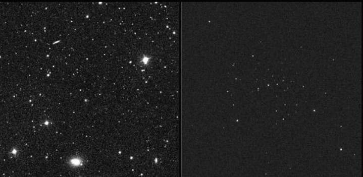
Two views of the ultra-faint dwarf galaxy Segue 1, a close neighbor and satellite of the Milky Way. Click to enlarge. [Sloan Digital Sky Survey (left) and M. Geha (right)]
Binary stars might be even more important in the smallest and faintest of galaxies, called ultra-faint dwarf galaxies (UFDs). UFDs are strange systems. They seem to be hybrids between globular clusters and dwarf galaxies, but they’re mostly classified as “galaxies” instead of stellar clusters. This classification is, in part, because UFDs (like other galaxies) appear to be dominated by dark matter based on observations of the velocities of their stars.
How does this work? The velocity dispersion (a measure of how much the stars’ velocities differ from the average motion of the galaxy) is high for a UFD. This suggests that there’s a lot of mass in the galaxy, making the stars orbit quickly around the galaxy’s center of mass. The velocity dispersions are even high enough to imply that there’s more matter in UFDs than just the visible matter: hence, dark matter! This could make UFDs promising targets to probe the physics of dark matter.
But binary stars could mess this all up. As the stars in binaries move around their companions, they can increase the velocity dispersion of a galaxy and make it seem like the galaxy has more mass than it really does. If UFDs have high fractions of binary stars, they might not have as much dark matter as we think!
Today’s Paper: Methods
To see if UFDs actually have lots of dark matter, we want to know if UFDs have lots of binaries. Unfortunately, there aren’t many measurements of the velocities of stars in UFDs. So today’s paper does the next best thing: the authors study the cousins of UFDs, called dwarf spheroidal (dSph) galaxies. These galaxies aren’t quite as puny as the ultra-faint dwarf galaxies, but they still have low masses compared to big systems like our Milky Way.
Lots of stellar velocities have been measured in dSph galaxies at different times, and Spencer et al. take advantage of these data. They come up with a model for the distribution of stellar velocities in a galaxy. This model takes lots of inputs, including the fraction of binary stars, as well as various parameters that describe binary systems. Using Bayesian techniques, the authors fit the model to the observed velocity distributions of different dSph galaxies. The best-fitting models (shown in Figure 1) then provide estimates of the input parameters, including the fraction of binary stars in each galaxy.
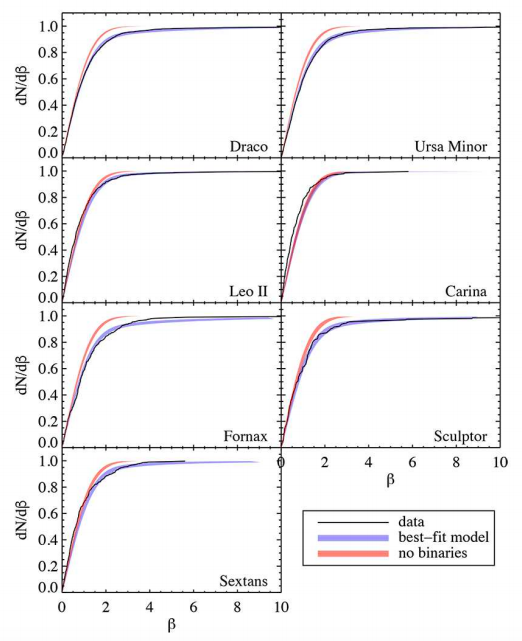
Figure 1. The distribution of changes in velocity (β) for seven different dSph galaxies (different panels). Black line marks the observed distribution and blue shaded region is the best-fit model. For comparison, the red shaded region is a model without binary stars. Most of the seven galaxies appear to have a nonzero fraction of binary stars. [Spencer et al. 2018]
Today’s Paper: Results
The best-fit models give lots of information about the binaries in each dwarf galaxy, which the authors describe and compare to previous literature. For simplicity, we’ll just focus on the binary fraction.
Spencer et al. present the first measurements of the binary fractions of the Draco and Ursa Major dSphs, and they check that their binary fraction measurements for five other dSphs agree with literature values. They then compare the binary fractions for all seven dSphs, and they find that the chances of all dSphs having the same binary fraction are incredibly low! This suggests that we can’t just assume a constant binary fraction for all dwarf galaxies.
Next, the authors go a step further to try to figure out what properties in dSphs affect the binary fraction. They find that the dSphs with smaller velocity dispersions seem to have lower binary fractions (Figure 2)! If this trend extends to UFD galaxies (which have low velocity dispersions), this could mean that UFDs don’t have that many binary stars. That’s good news for dark matter lovers — it means that the velocity dispersions of UFDs might not be heavily contaminated by binary stars, so UFDs could indeed have lots of dark matter.
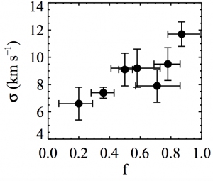
Figure 2. The stellar velocity dispersion σ of 7 dSph galaxies as a function of their binary fractions f. This suggests that dSph galaxies with higher velocity dispersions may have higher fractions of binary stars. The authors made lots of other plots like these, but this parameter had the most convincing correlation with binary fraction. [Spencer et al. 2018]
It’s hard to make any definitive claims based on only seven dSph galaxies, but these potential results open up lots of questions about binary stars. What physical mechanism causes dSphs to have different binary fractions? Do the trends that Spencer et al. presented for dSphs still hold for ultra-faint dwarf galaxies?
As usual, an interesting scientific result leads to more questions than answers.
About the author, Mia de los Reyes:
I’m a grad student at Caltech, where I study the chemical composition of stars in nearby dwarf galaxies. Before coming to sunny California, I spent a year as a postgrad at the University of Cambridge, studying star formation in galaxies. Now that I’ve escaped to warmer climates, my hobbies include rock climbing and finding free food on campus.

 Lifetime in Color")