
A Naked-Eye Superflare Detected from Proxima Centauri
Editor’s note: Astrobites is a graduate-student-run organization that digests astrophysical literature for undergraduate students. As part of the partnership between the AAS and astrobites, we occasionally repost astrobites content here at AAS Nova. We hope you enjoy this post from astrobites; the original can be viewed at astrobites.org!
Title: The First Naked-Eye Superflare Detected from Proxima Centauri
Author: Ward S. Howard, Matt A. Tilley, Hank Corbett, Allison Youngblood, R. O. Parke Loyd, et al.
First Author’s Institution: University of North Carolina at Chapel Hill
Status: Submitted to ApJL
Proxima Centauri is the closest known star to the Sun at just 4.246 light-years (1.302 parsecs) away. It’s a red dwarf of spectral type M6 with about 12% of the Sun’s mass, 1.2 times the diameter of Jupiter, and 0.17% of the Sun’s luminosity. It hosts the closest known exoplanet to us, Proxima Centauri b, which was discovered in 2016 as covered in this Astrobite. Like our Sun, it’s on the main sequence, steadily fusing hydrogen into helium in its core. Yet this tiny star is way more active than the Sun is!
Red dwarfs like Proxima Centauri have interiors that are fully convective, meaning that the energy generated by fusion in their cores is transported to the surface primarily via convection. Like a pot of boiling water, you can think of it as being one giant ball of boiling plasma. This turnover of ionized gas generates powerful magnetic fields, which are carried to the surface along with the bubbles of hot plasma. When these bubbles reach the surface the energy contained in the magnetic fields can be violently released in the form of stellar flares, which can grow as large as Proxima Centauri itself and reach temperatures of up to 27 million K! (Normally its effective surface temperature is around 3,000 K.) These flares from Proxima Centauri have been observed frequently in the past (for instance in this recent Astrobite).
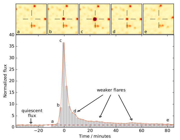
Figure 1: The light curve of Proxima Centauri as seen by the Evryscope around the time of the superflare. Three weaker (but still strong) flares were detected in the aftermath of the superflare, marked by arrows. [Howard et al. 2018]
Erupting With (Super)Flair
In this paper, the authors report the discovery of the first-known superflare from Proxima Centauri (see Figure 1 for the light curve), a flare roughly ten times more powerful than any seen before. Normally Proxima Centauri sits at a visual magnitude of 11.13, approximately 100 times fainter than the human eye can see. But during the superflare the authors calculated that it would have reached an apparent visual magnitude of 6.8 for a few minutes, just bright enough to be seen with the naked eye in extremely dark skies! (No accounts of anyone actually seeing it by eye at the time are known, though.)
To discover this superflare the paper authors used data from the Evryscope, which we’ve covered in this Astrobite. Despite the name it’s not actually a single giant telescope formed out of every telescope on Earth (sadly), but is instead a unique collection of twenty-seven small telescopes all mounted on a single German Equatorial mount in Chile, one of its goals being to catch and record these short-duration transient events. It pans across the sky throughout the night taking images of 8,000 square degrees of the southern night sky simultaneously every two minutes, all night long.
On March 18, 2016, at 8:32:10 UT the Everyscope detected a superflare that lasted for over an hour, though the bulk of the energy was emitted in the first ten minutes. The authors estimate that the total energy radiated at all wavelengths was 1033.5 ergs, ten times more than any previously seen flare. However, based on the many other, less powerful flares observed by the Evryscope, the authors estimate that flares with an energy release of 1033 or more ergs probably occur around 5 times per year.
Ozone? More Like NO-zone
The authors also investigated the effects of so many flares on a hypothetical atmosphere of Proxima Centauri b by running a 1D atmospheric simulation in which the planet is assumed to have an Earth-like atmosphere. Strong proton fluxes from coronal mass ejections associated with flares can destroy ozone by first breaking nitrogen (N2) apart into nitrogen atoms that react with oxygen (O2) to form NO and O. The NO then reacts with ozone in a catalytic reaction to form NO2, depleting the ozone (O3) layer in a very efficient manner.
The simulation generated a series of flares with a range of energies compatible with what has been observed in the past, which interacted with the model atmosphere over a simulated five-year period. Each flare had an 8% chance to have a strong proton flux associated with it (based on other work). Even this low chance of producing strong proton fluxes, however, depleted the ozone layer by 90% within five years (as shown in Figure 2). Thus it seems highly probable that Proxima Centauri b has no ozone layer to speak of.
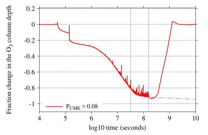
Figure 2: The depth of the ozone column in the simulation performed in the paper. The two dashed lines denote one year and five years after starting the simulation. Flares were stopped after five years in the simulation which leads the solid line to recover back up to full, but the authors note that the dashed line is more likely in reality where flares continue. [Howard et al. 2018]
Summary
Proxima Centauri is a very active star, and with the Evryscope up and running we’re in a good position to catch the next superflare it gives off (along with any regular flares). And if you were planning a beachside vacation to Proxima Centauri b, you may want to hold off until you find a sunscreen with an SPF of a million or so.
About the author, Daniel Berke:
I’m a first-year grad student at Swinburne University of Technology in Melbourne, where I search for variation in the fine-structure constant on the Galactic scale. When I’m not at uni I enjoy a variety of creative enterprises including photography, blogging, and video editing, or just relaxing with a good video game or some classical music.


