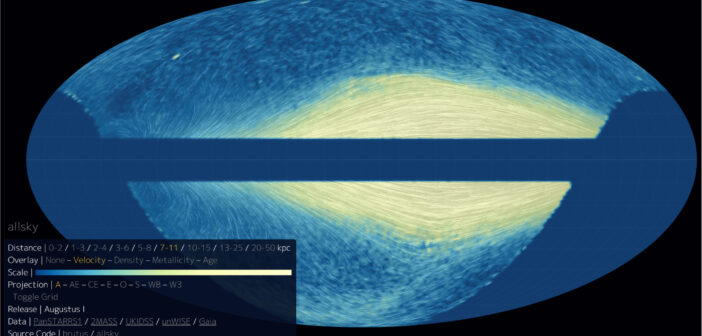
Ready to be mesmerized by an elegant data visualization? You can now watch the endless, swirling trajectories of 170 million stars in our galaxy using a simple interactive tool. A team led by Joshua Speagle (沈佳士) from the University of Toronto used data from five surveys — the Panoramic Survey Telescope and Rapid Response System (Pan-STARRS), the Two Micron All Sky Survey (2MASS), the United Kingdom Infrared Telescope Infrared Deep Sky Survey (UKIDSS), the “unofficial” Wide-field Infrared Survey Explorer (unWISE), and the Gaia survey — to craft this visualization. In the image above, the color scale shows the tangential speed of stars within a certain distance bin, while the white streamlines show the stars’ tangential velocity. You can play around with the full visualization, which allows you to filter by distance and switch the color overlay between velocity, density, metallicity, and age. To learn more about the data selection process and the construction of the final star catalog, be sure to check out the full research article linked below.
Citation
“Mapping the Milky Way in 5D with 170 Million Stars,” Joshua S. Speagle et al 2024 ApJ 970 121. doi:10.3847/1538-4357/ad2b62
