
Hertzsprung–Russell (HR) diagrams have been an integral part of astronomy for over a hundred years. Stars at different stages of life occupy different parts of the diagram, which allows us to take in a population of stars at a glance. The Gaia mission provided us with an enormous sample of stars — what can we learn by putting them in a HR diagram?
Have You Heard About HR Diagrams?
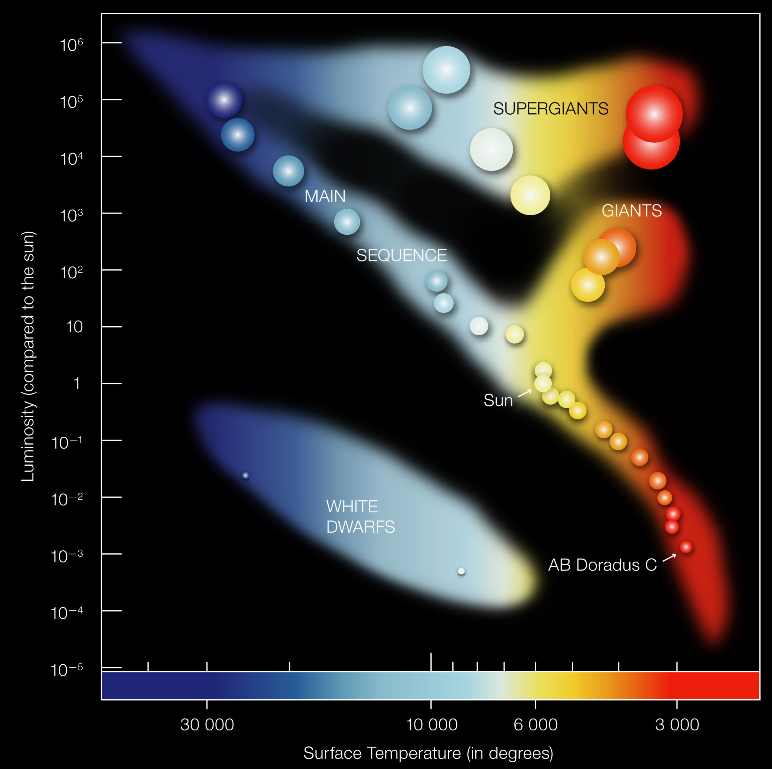
A qualitative HR diagram showing where different types of stars live. The colors are roughly true to life. Temperature is given on the x-axis with luminosity or brightness on the y-axis. [ESO]
It’s also interesting to see where stars cluster on HR diagrams. Some parts of this plot will never be filled in because it’s physically impossible for stars to occupy those spaces. So, by plotting large samples of stars on HR diagrams, we can learn more about stellar evolution.
The Gaia mission is observing an enormous number of stars — 1.7 billion of them! — with very high precision, and a lot of great science has already been done with the first two Gaia data releases. In a recent paper, Wei-Chun Jao (Georgia State University) and Gregory Feiden (University of North Georgia) used Gaia data to study stars that cluster in a region on the HR diagram called the main sequence.
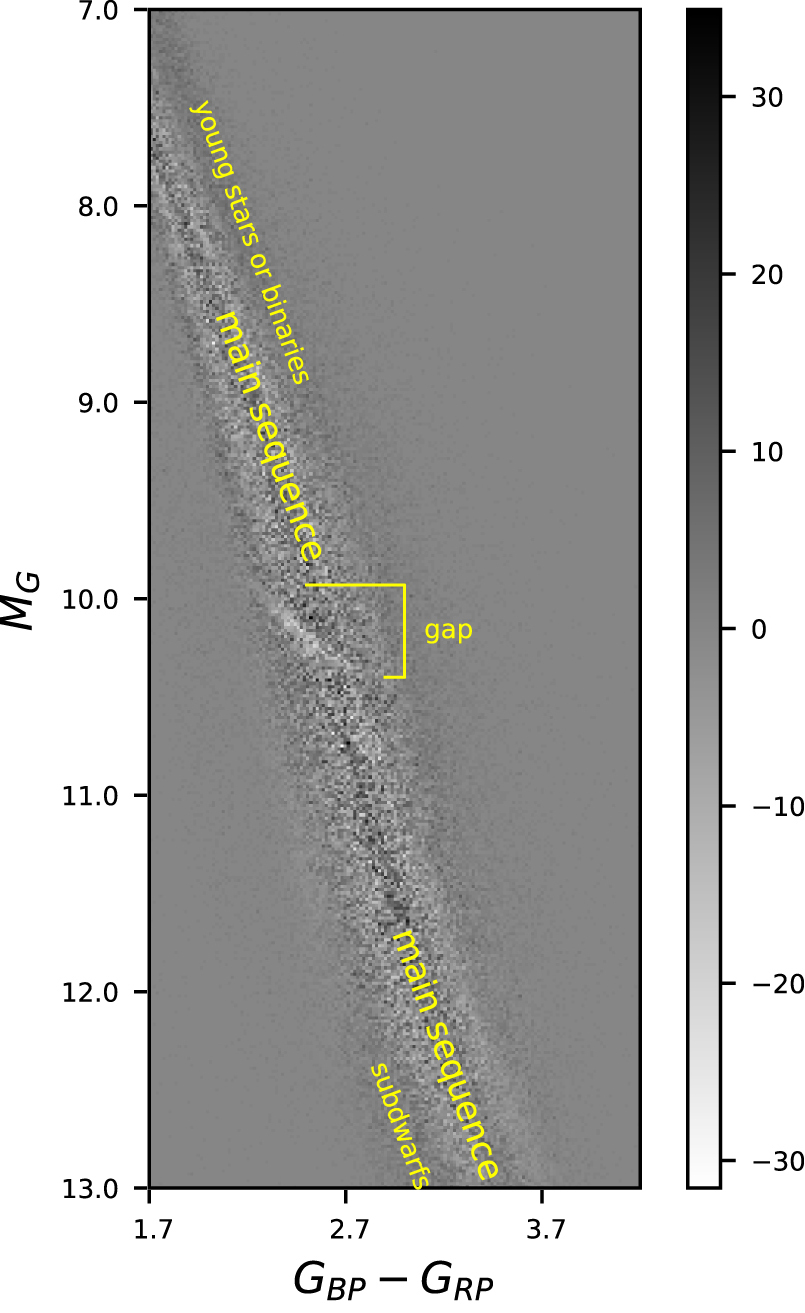
The subtracted HR diagram with different types of stars highlighted along with the main sequence gap. The x-axis is (blue – red) Gaia magnitude (i.e., color), and the y-axis is total Gaia magnitude. Click to enlarge. [Adapted from Jao & Feiden 2020]
Analyzing the Main Sequence
Main sequence stars have one thing in common: their fuel is hydrogen. However, they can fall on different parts of the main sequence based on characteristics like their mass, broader elemental composition, or magnetic activity. For instance, a high mass main sequence star will look bluer and brighter than a low mass main sequence star. The Sun (perhaps surprisingly) lands smack in the middle of the main sequence.
With the sheer volume of its data, the Gaia mission has added a third dimension to HR diagrams: density. It’s now clearer than ever which areas of the HR diagram stars avoid. In fact, a previous study led by Jao used Gaia data to identify a gap in the lower (redder, fainter) main sequence. In this new study, Jao and Feiden applied Fourier analysis to study the lower main sequence gap in more detail.
One way to understand Fourier analysis is that it breaks down a signal into component parts, allowing you to identify the most prominent component of the signal. When applied to an image, Fourier analysis can enhance real features and cut down on noise.
Mind the Gap!
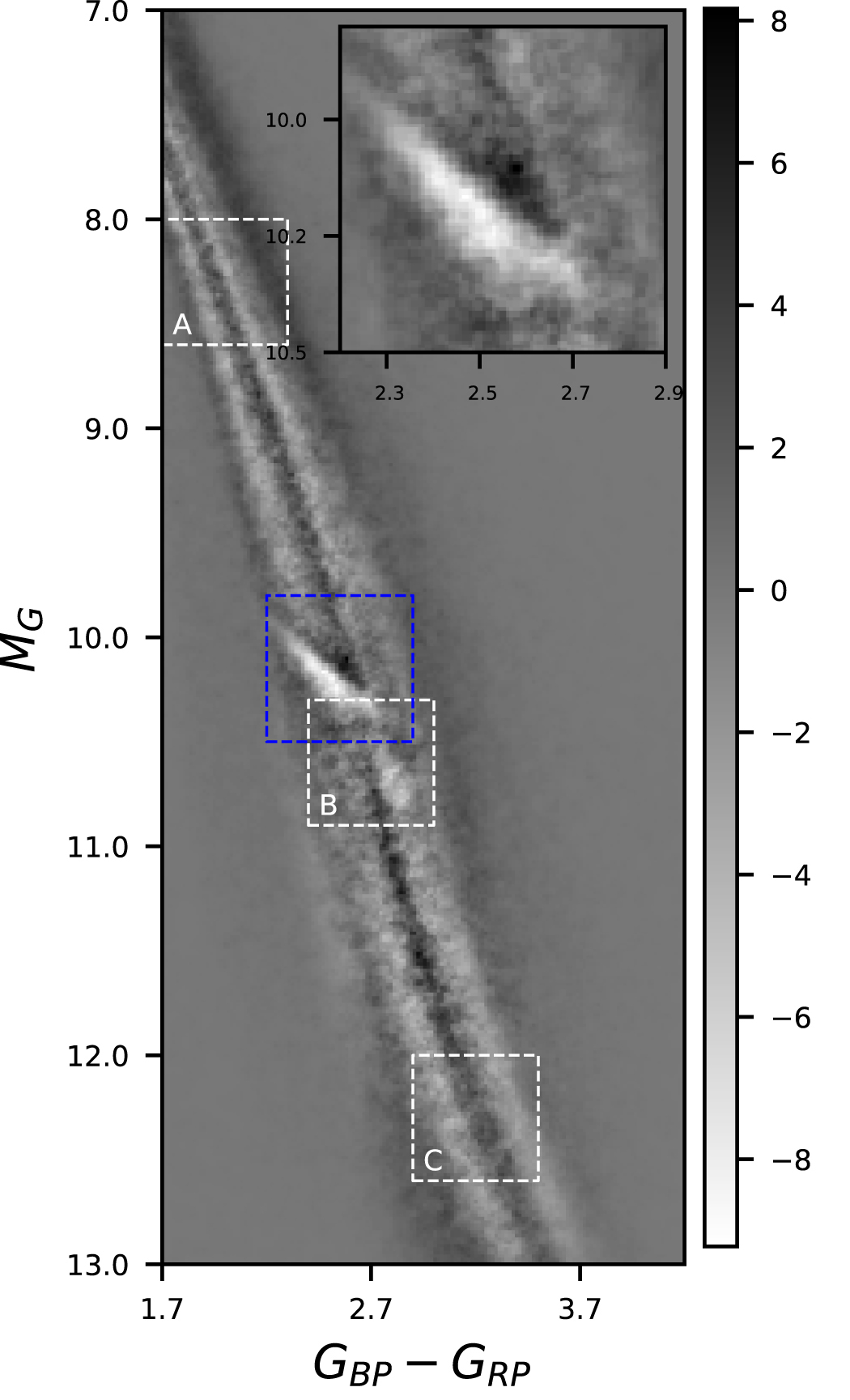
The subtracted HR diagram after the Fourier analysis, with unusual features highlighted by dashed squares. The blue square is the main sequence gap; it’s shown in greater detail in the inset. The white squares labeled A and C show “stripes” across the main sequence. The white square labeled B shows a patchy feature near the main sequence gap. Click to enlarge. [Adapted from Jao & Feiden 2020]
Jao and Feiden found that there were more stars above the main sequence gap than below it. The gap was also more “empty” at the blue end than at the red end. They also found “stripes” running across the main sequence and a patchy feature near the main sequence gap.
What could be causing these features? The main sequence gap is likely due to atypical helium fusion, which causes the radius of stars to change. The gap might be less empty on the red side because it’s filled in by younger stars and indistinct binary systems. The other features, however, present an interesting puzzle. Could more detailed stellar models help? Stay tuned!
Citation
“Fine Structures in the Main Sequence Revealed by Gaia Data Release 2,” Wei-Chun Jao and Gregory A. Feiden 2020 AJ 160 102. doi:10.3847/1538-3881/aba192
5 Comments
Pingback: From AAS NOVA: “Getting Deeper into HR Diagrams with Gaia” | sciencesprings
Pingback: Zagłębianie się w ciąg główny z misją Gaia – PTMA Kraków
Pingback: Zagłębianie się w ciąg główny z misją Gaia – Astronomia Śląska
Pingback: Astronomy professor and alumnus have papers published – NewsLive
Pingback: Astronomy professor and alumnus have papers published - Online Local News Today